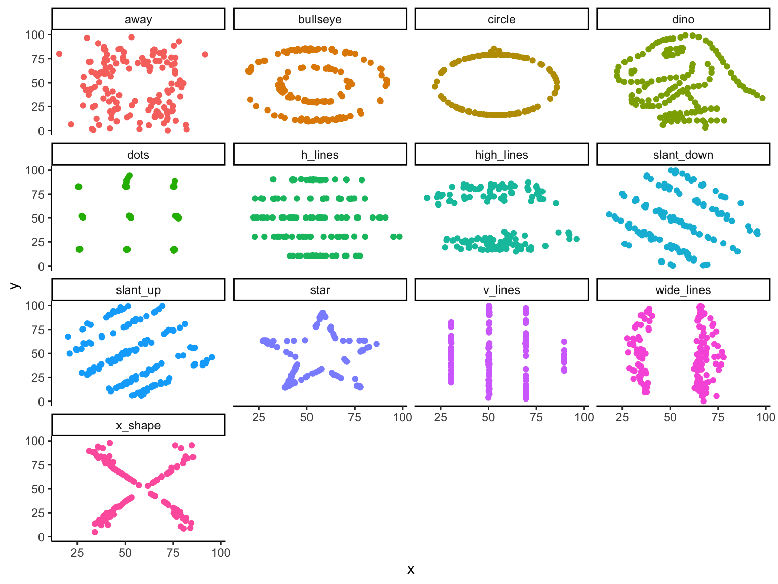
# A tibble: 13 × 6
   dataset    mean_x mean_y std_dev_x std_dev_y corr_x_y
   <chr>       <dbl>  <dbl>     <dbl>     <dbl>    <dbl>
 1 away         54.3   47.8      16.8      26.9  -0.0641
 2 bullseye     54.3   47.8      16.8      26.9  -0.0686
 3 circle       54.3   47.8      16.8      26.9  -0.0683
 4 dino         54.3   47.8      16.8      26.9  -0.0645
 5 dots         54.3   47.8      16.8      26.9  -0.0603
 6 h_lines      54.3   47.8      16.8      26.9  -0.0617
 7 high_lines   54.3   47.8      16.8      26.9  -0.0685
 8 slant_down   54.3   47.8      16.8      26.9  -0.0690
 9 slant_up     54.3   47.8      16.8      26.9  -0.0686
10 star         54.3   47.8      16.8      26.9  -0.0630
11 v_lines      54.3   47.8      16.8      26.9  -0.0694
12 wide_lines   54.3   47.8      16.8      26.9  -0.0666
13 x_shape 54.3 47.8 16.8 26.9 -0.0656Data Visualization Day 1
Data Science for Studying Language and the Mind
2025-09-02
Datasaurus dozen

ggplot2
Figure 1
ggplot2’s grammar of graphics
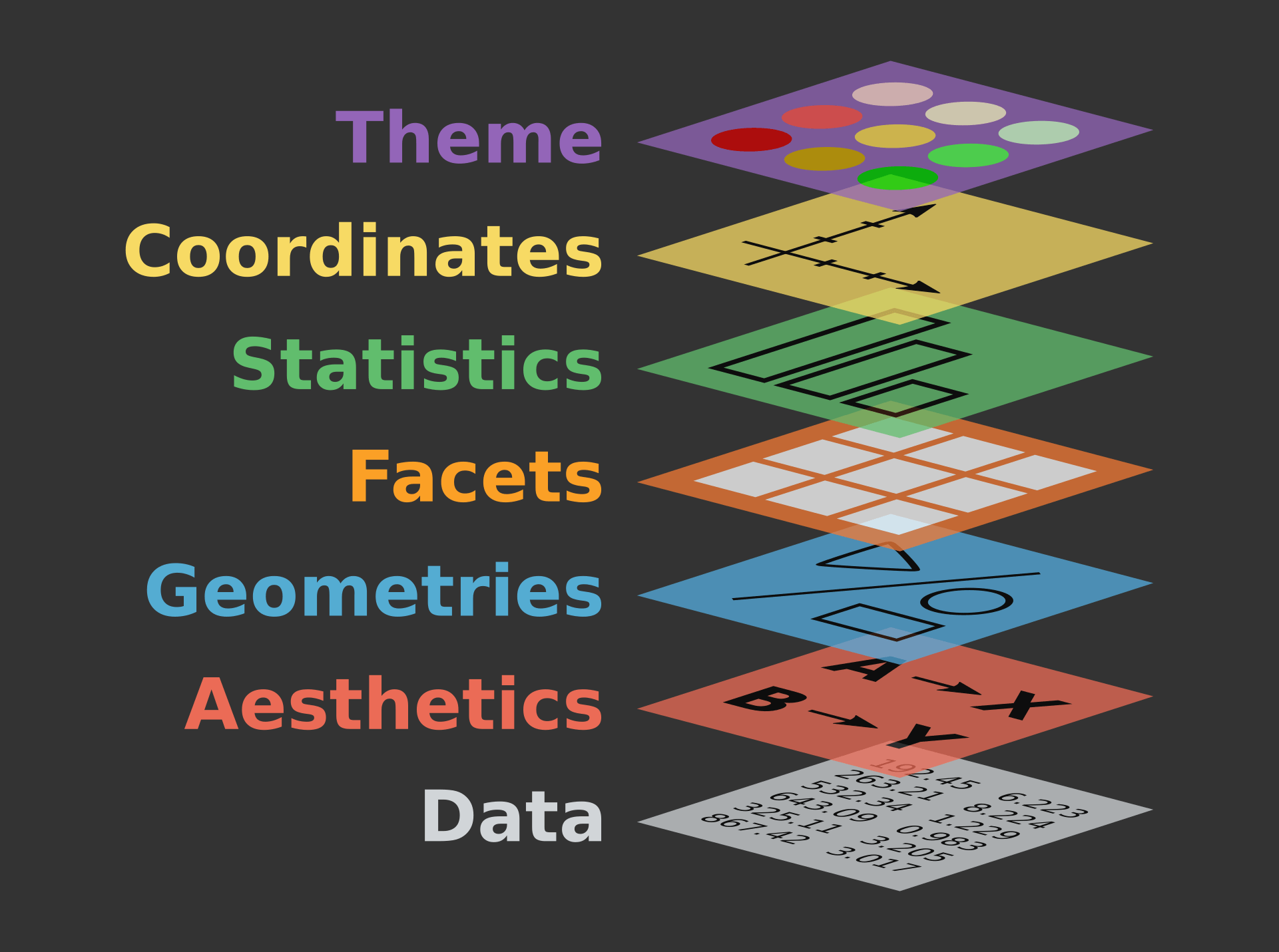
Figure 2
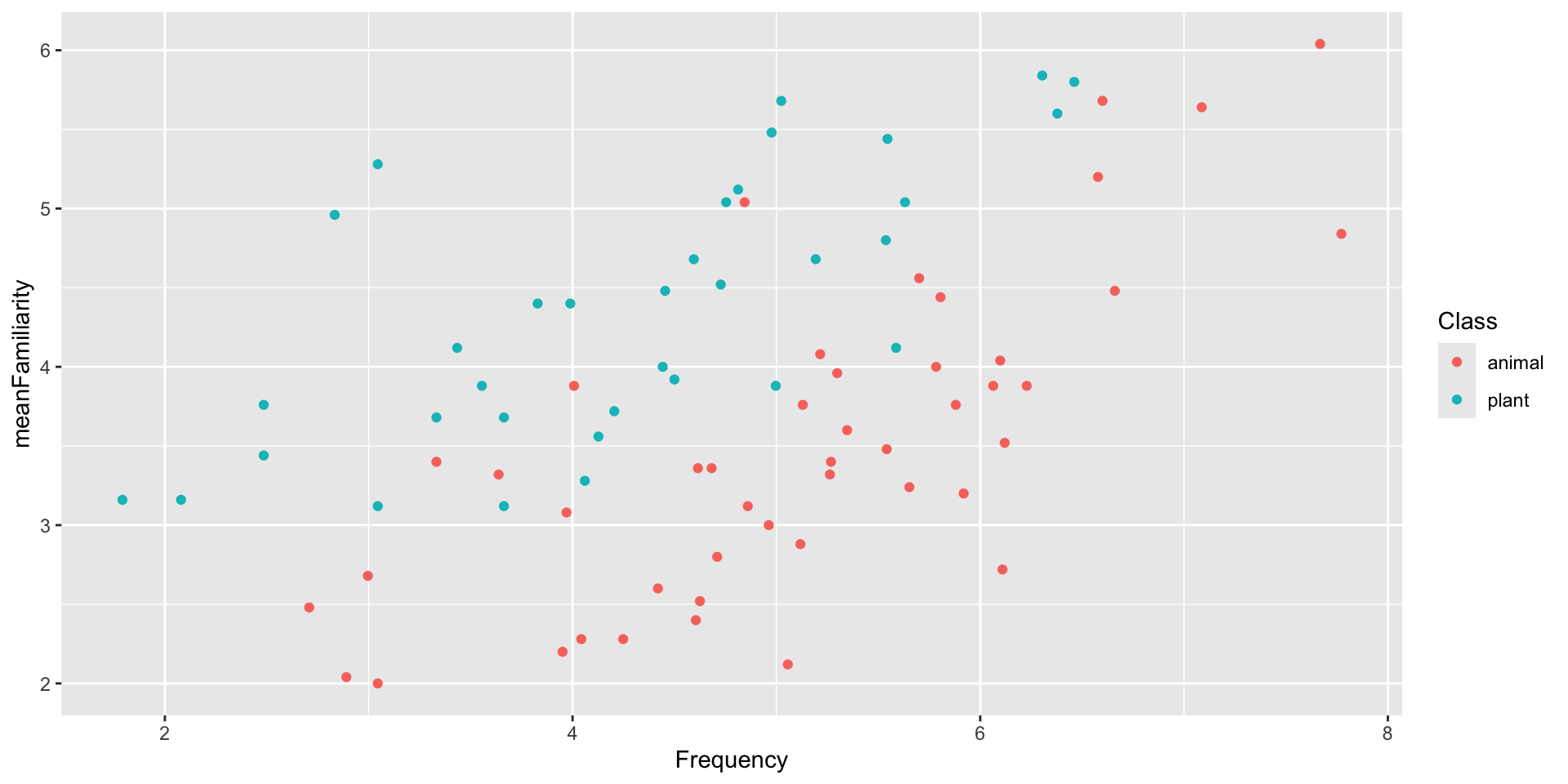
Today’s goal
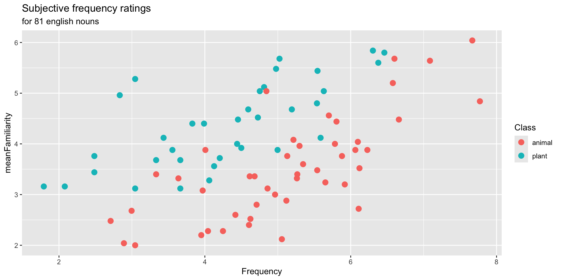
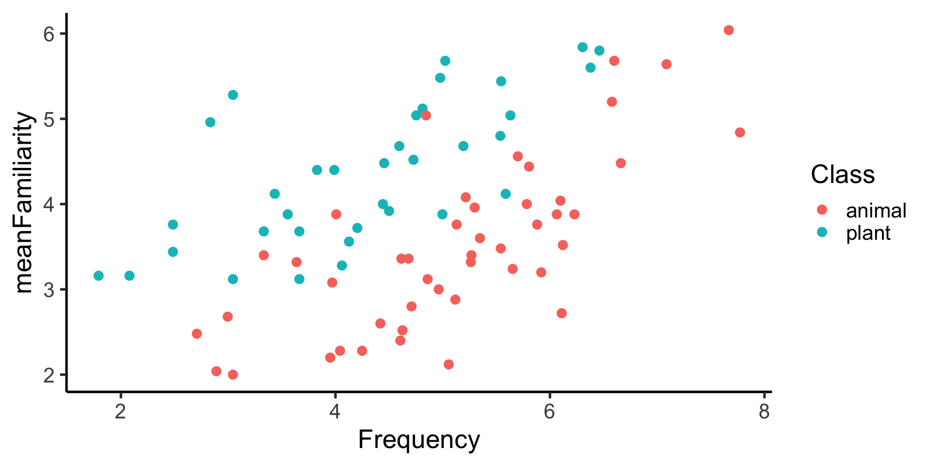
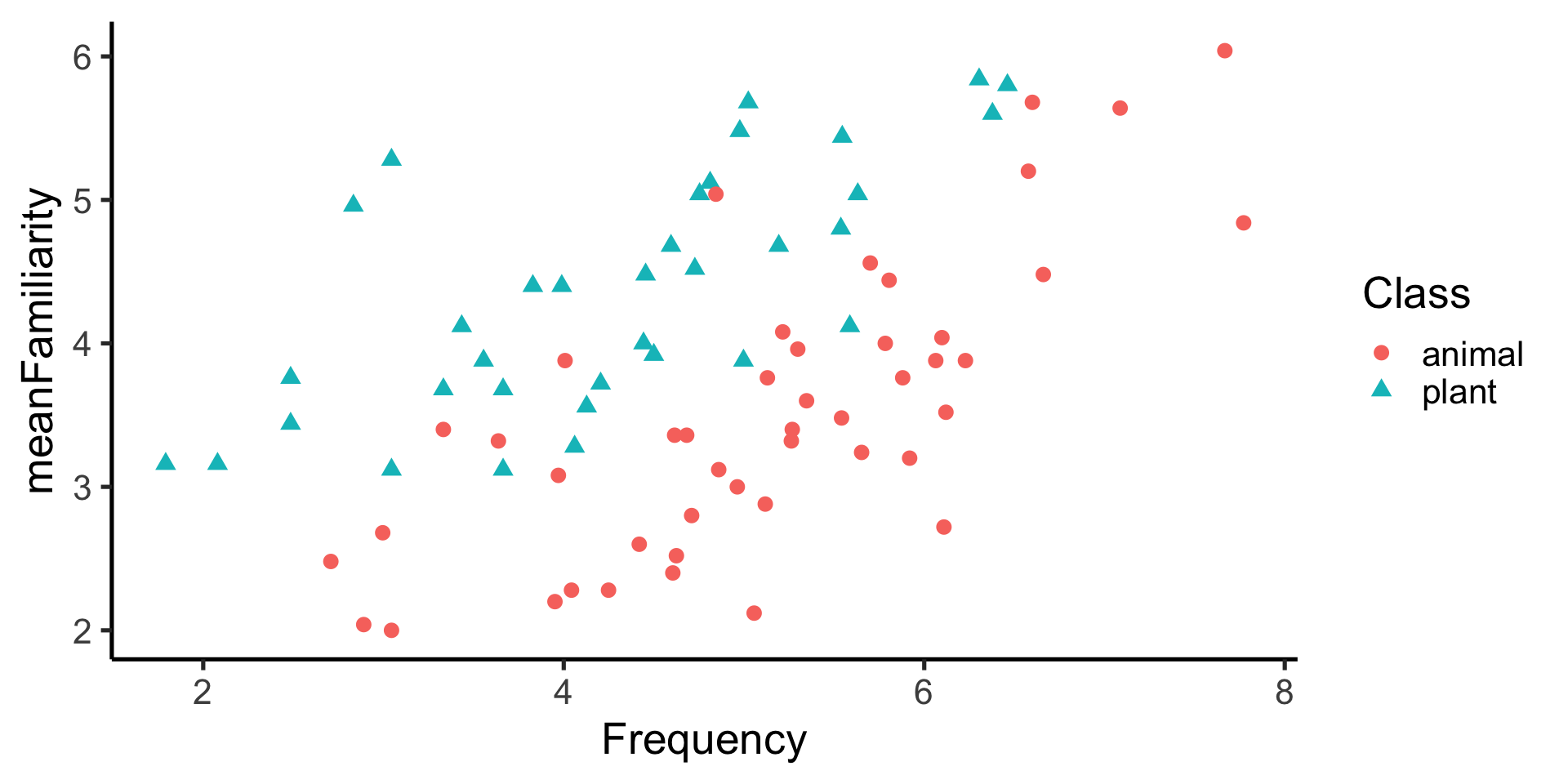
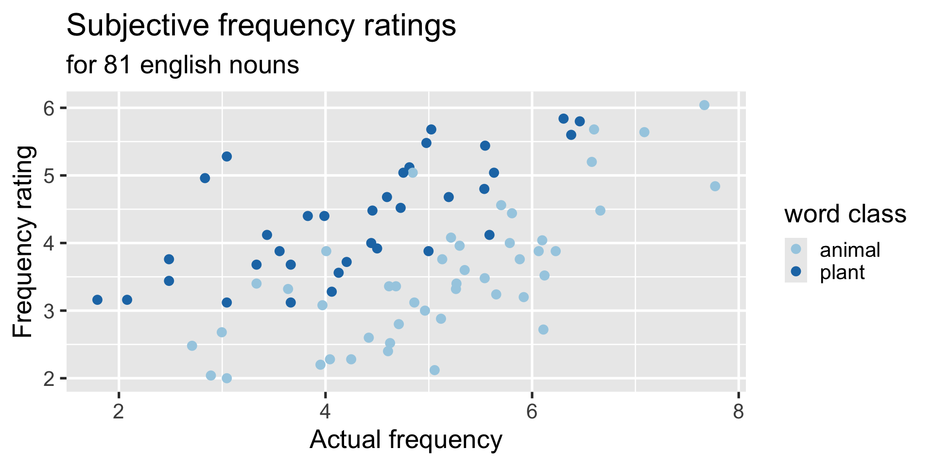
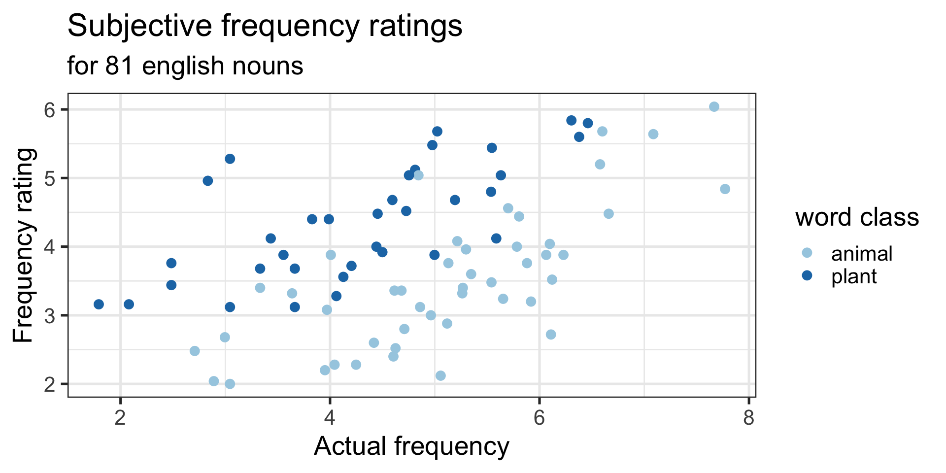
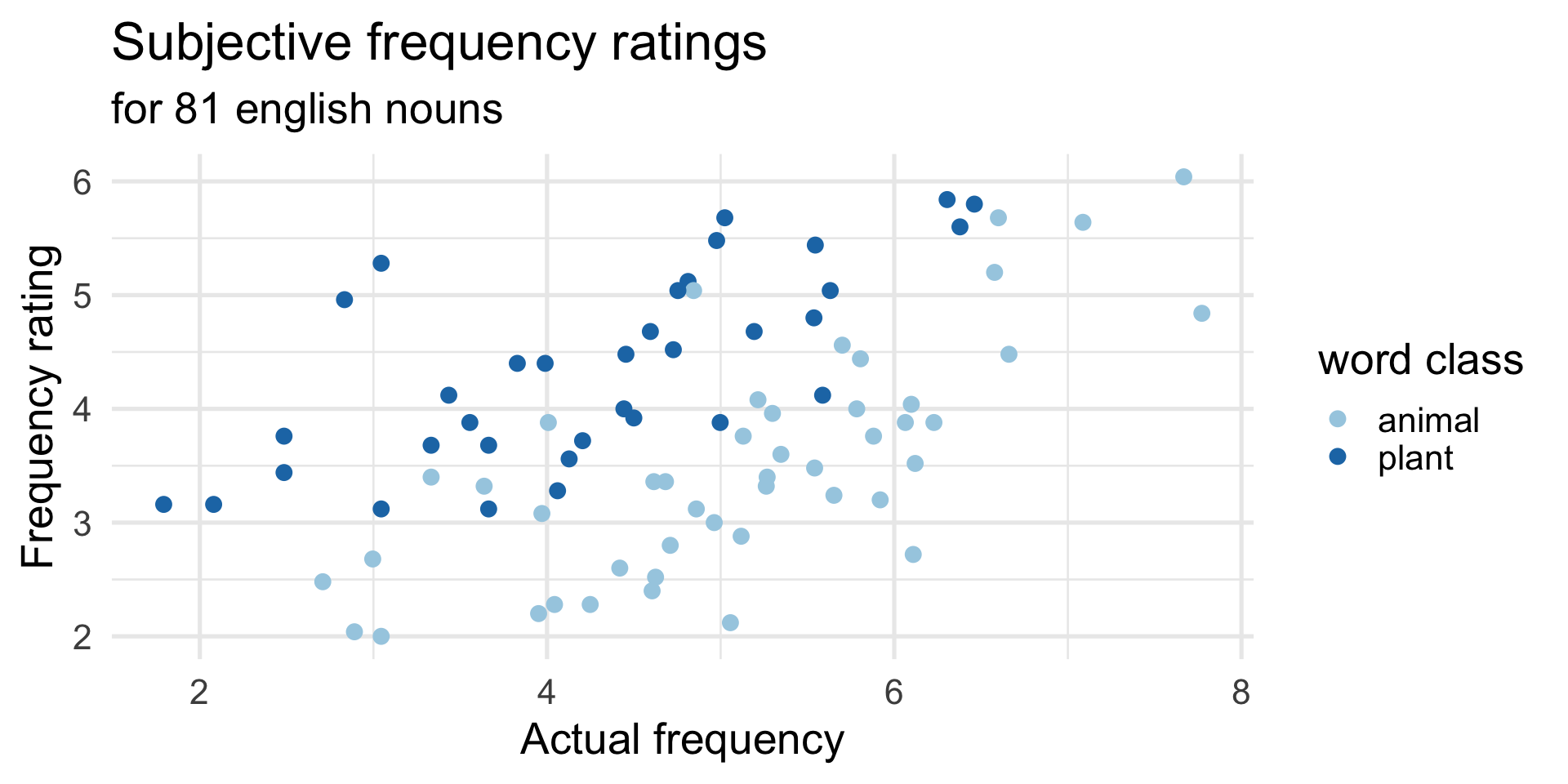
Create this figure showing the relationship between actual frequency and subjective frequency rating of each word, considering the class the word belongs to
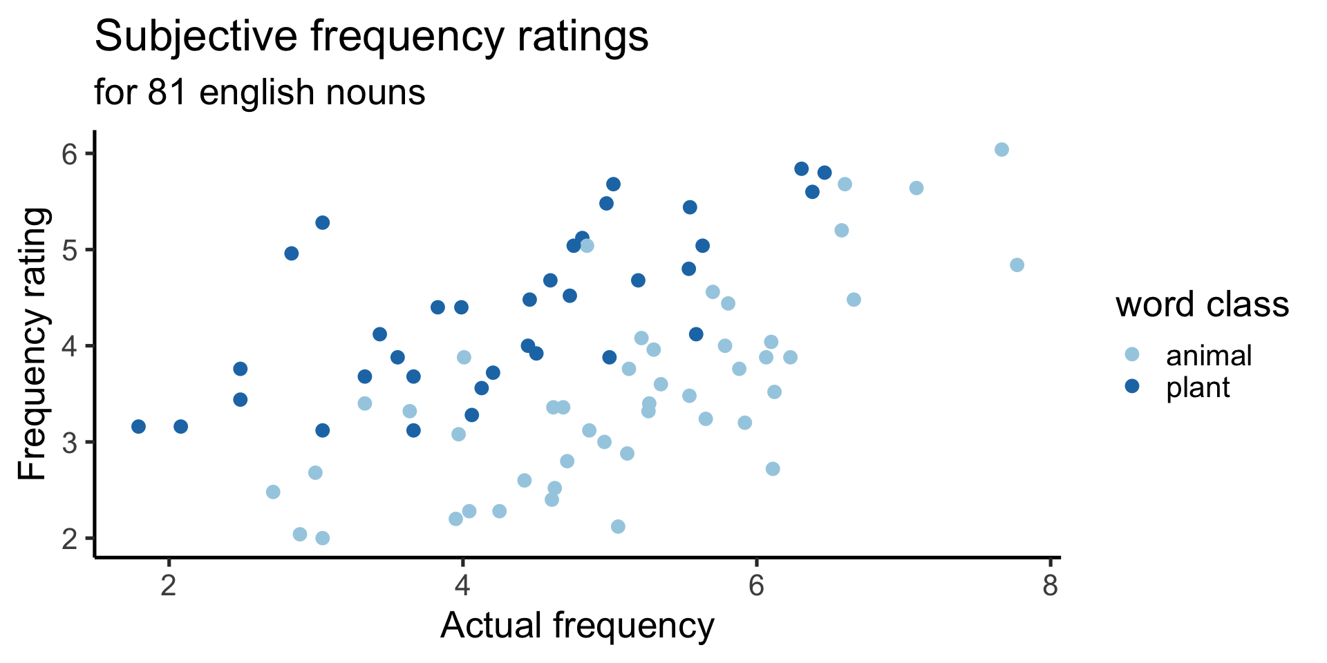
1 data
Use
ratingsdata

2 aesthetic mapping
Map
Frequencyto x-axis andmeanFamiliarityto y-axis.
3 geom
Represent each value with a point.
Mapping categorical variables
When a categorical variable is mapped to an aesthetic, ggplot2 will automatically assign a unique value of the aesthetic (here color) … a process known as
scaling. – R4DS
Global vs. local aesthetics
- globally in
ggplot(), which are passed down to all geoms - locally in
geom_*()which are used by that geom only

Mapping vs. setting aesthetics
- mapping allows us to determine a geom’s aesthetics based on a variable, and is passed as argument in
aes() - setting allows us to set a geom’s aestheics to a constant value (not based on any variable), and passed as argument in
geom_*()directly
labels: title and subtitle
Add title “Subjective frequency ratings” with subtitle “for 81 english nouns”
labels: x and y axis
Label x-axis “Actual frequency” and y-axis “Frequency rating”
labels: legend
Label the legend “word class”.
themes
Apply classic theme with base_size 20.
ggplot(
    data = ratings,
    mapping = aes(
        x = Frequency,
        y = meanFamiliarity
    )
) +
geom_point(
mapping = aes(color = Class),
size = 3
) +
labs(
title = "Subjective frequency ratings",
subtitle = "for 81 english nouns",
x = "Actual frequency",
y = "Frequency rating",
color = "word class"
) +
theme_classic(base_size = 20) 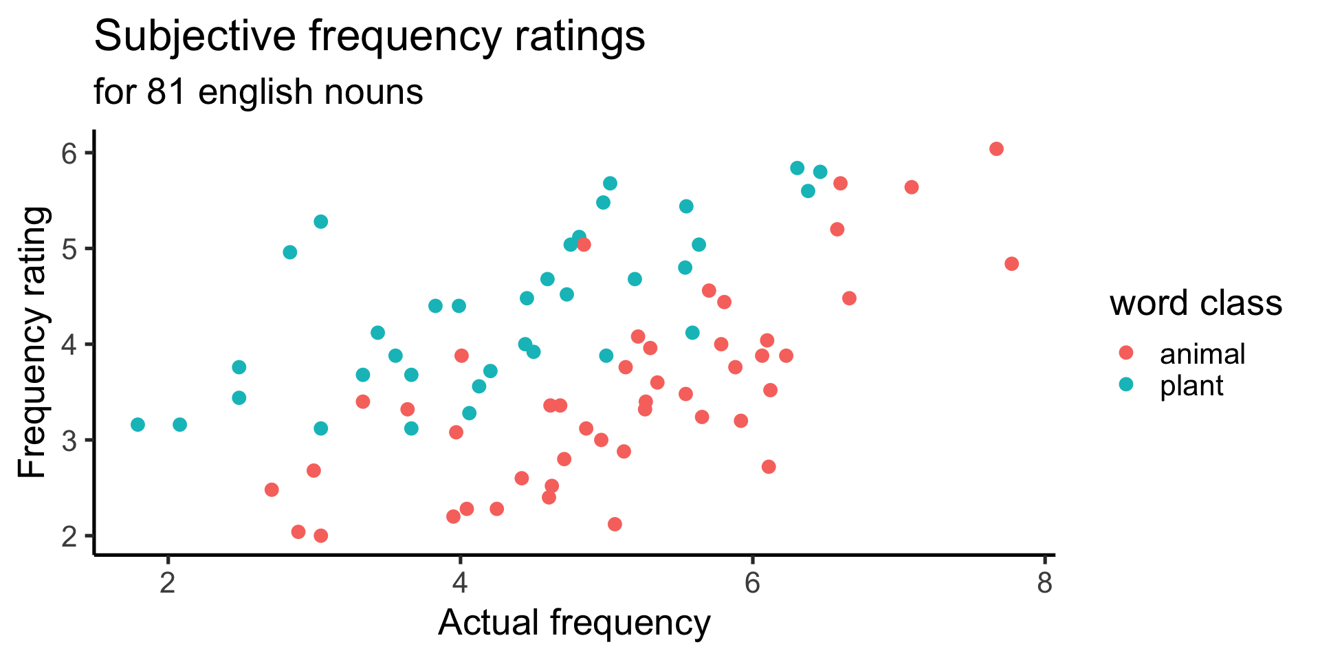
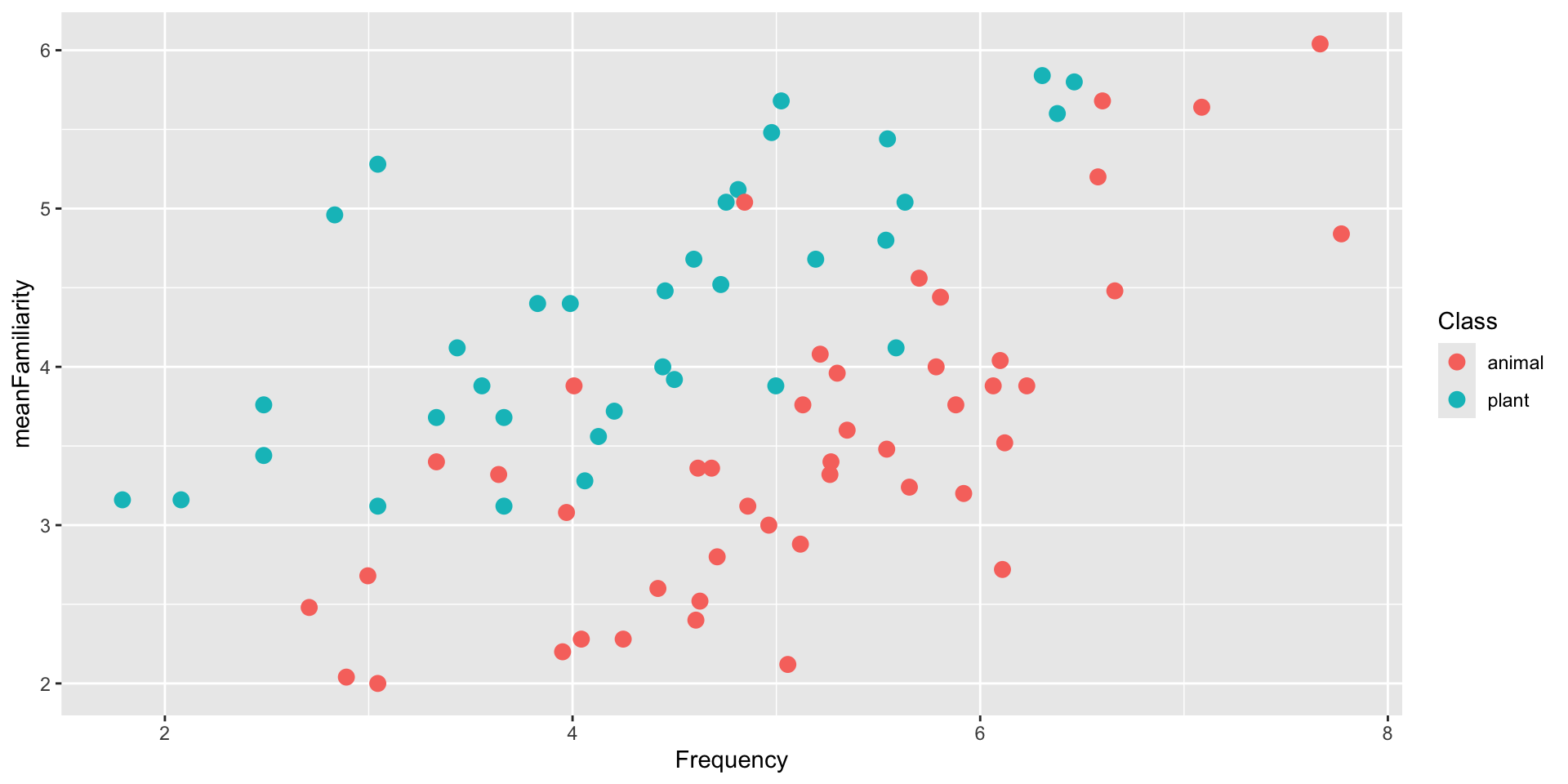
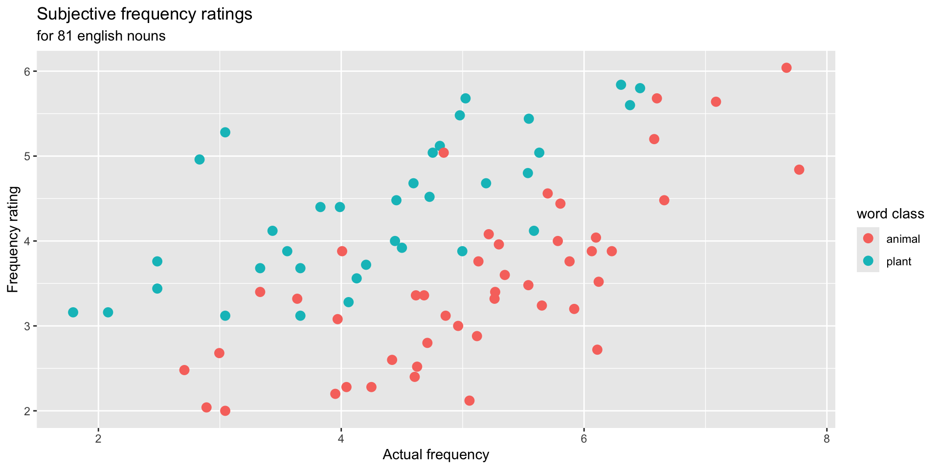
scales: changing color
Remember: When a categorical variable is mapped to an aesthetic, ggplot2 will automatically assign a unique value of the aesthetic (here color) … a process known as
scaling. – R4DS
ggplot(
    data = ratings,
    mapping = aes(
        x = Frequency,
        y = meanFamiliarity
    )
 ) +
  geom_point(
    mapping = aes(color = Class),
    size = 3
) +
labs(
title = "Subjective frequency ratings",
subtitle = "for 81 english nouns",
x = "Actual frequency",
y = "Frequency rating",
color = "word class"
) +
theme_classic(base_size = 20) +
scale_color_brewer(palette = "Paired")
color
Map the color aesthetic to a variable
color
Set a constant value for the color aesthetic
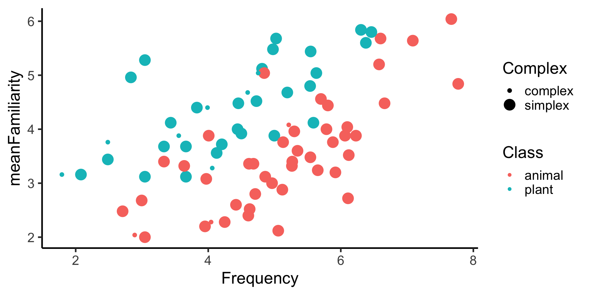
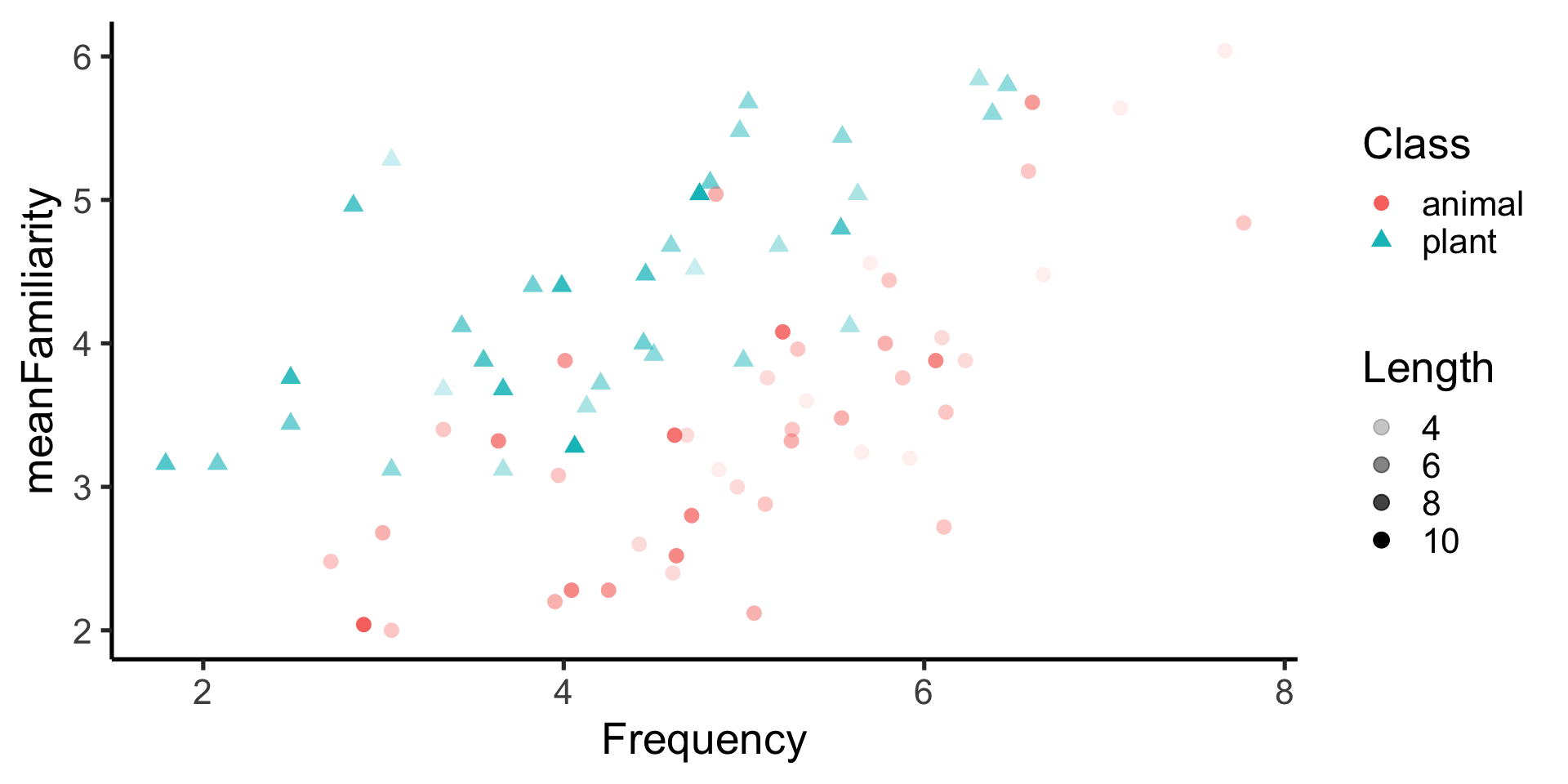
size
Setting a constant value for the size aesthetic

size
Mapped the size aesthetic to a variable
shape
Map the shape aesthetic to a different variable
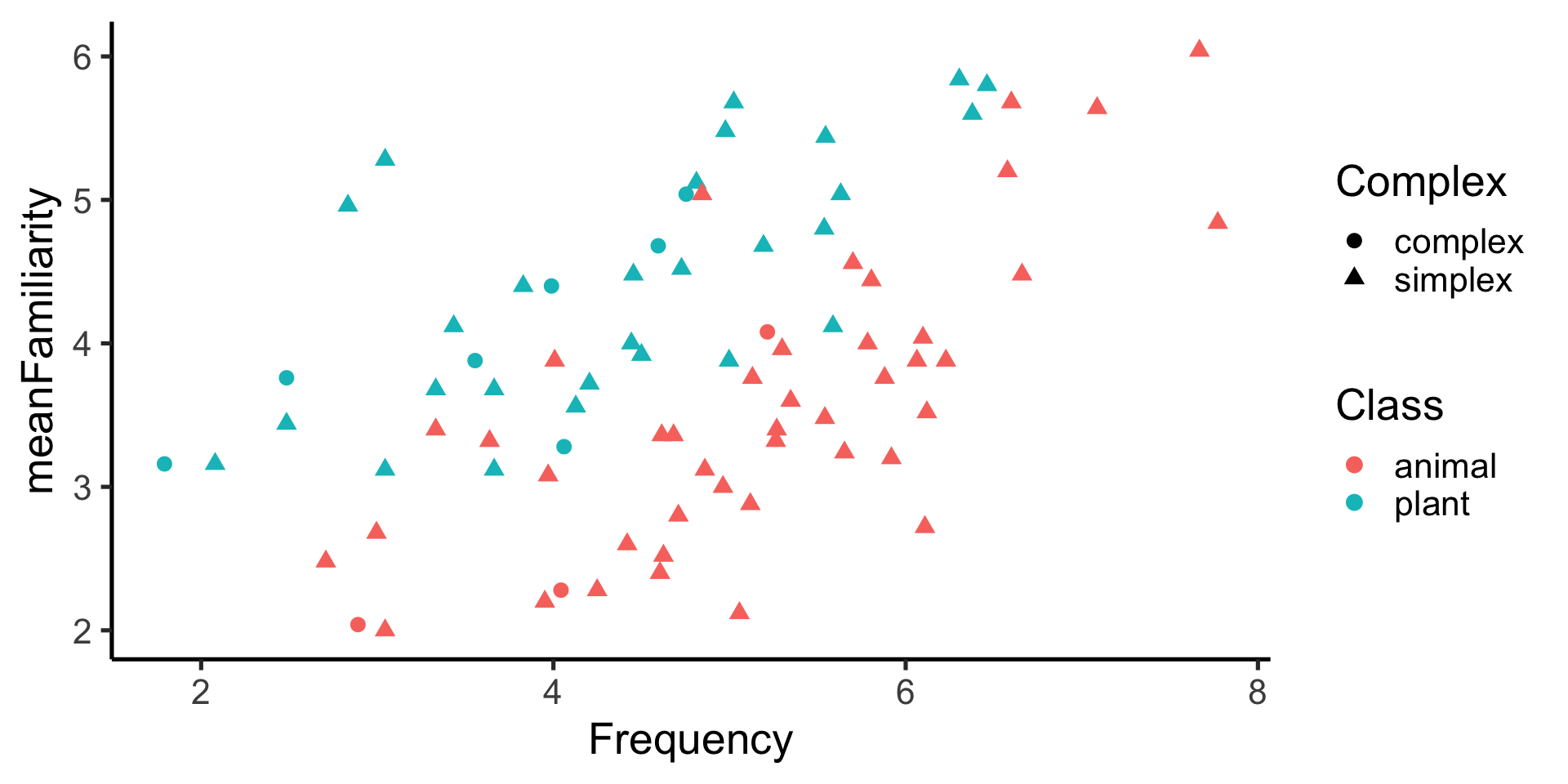
shape
Map the shape aesthetic to the same variable
alpha
Set a constant value for the alpha aesthetic
alpha
Mapped to a variable
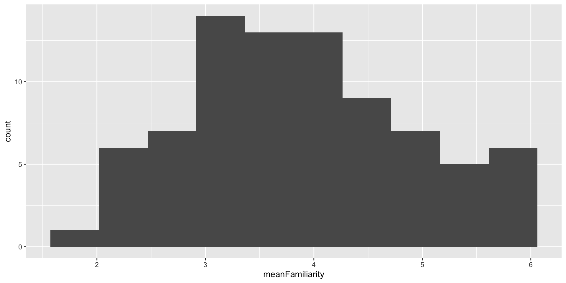
geom_histogram()
A histogram divides the x-axis into equally spaced bins and then uses the height of a bar to display the number of observations that fall in each bin. – R4DS
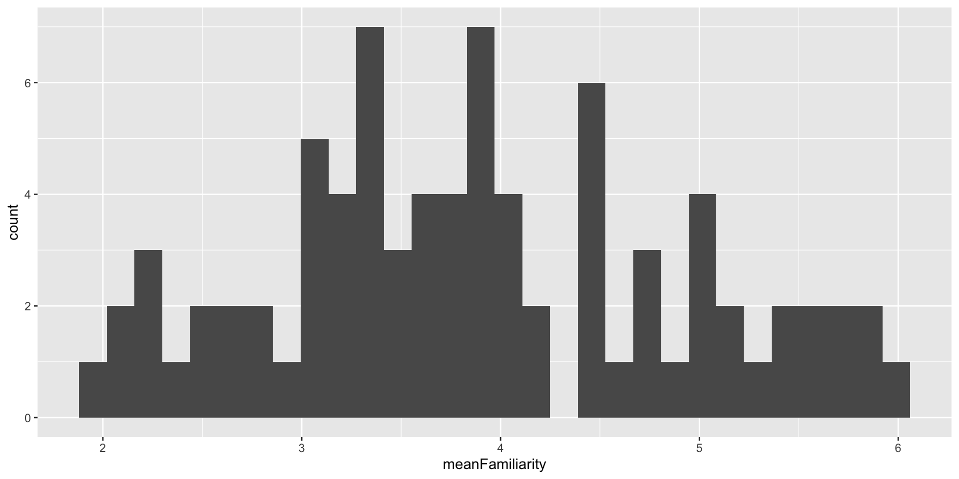
geom_histogram()
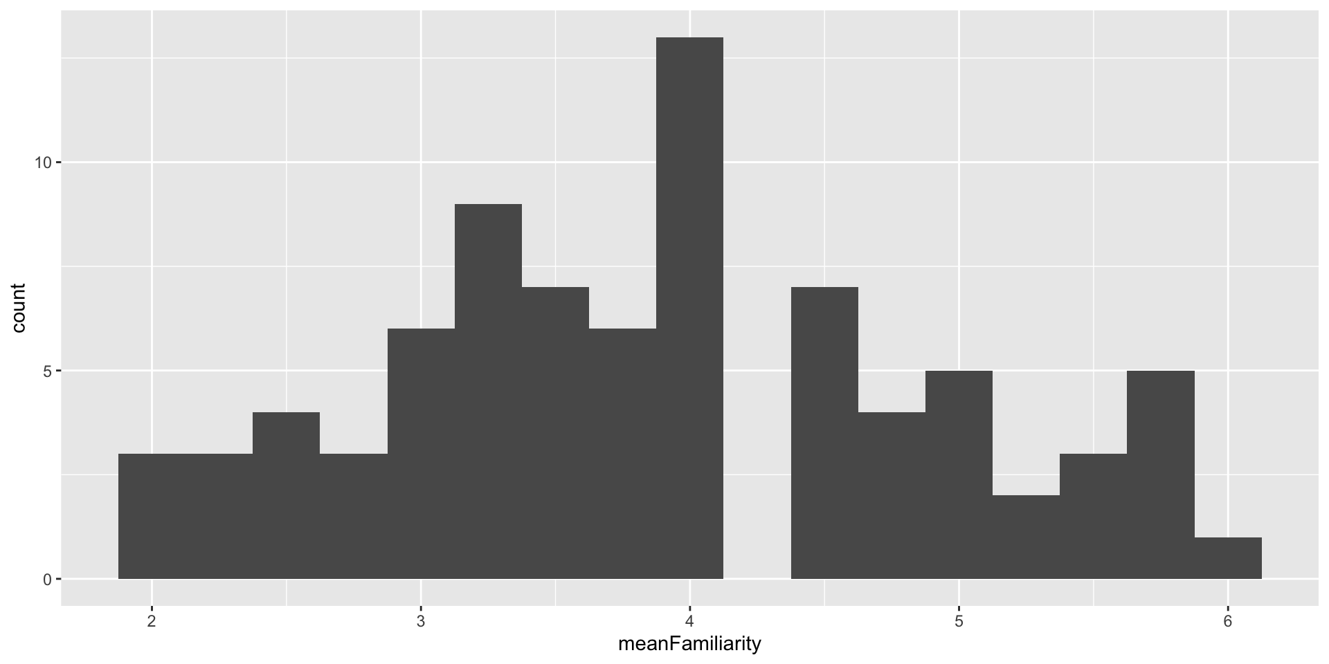
bins - How many bins should we have?
geom_histogram()
binwidth - How wide should the bins be?
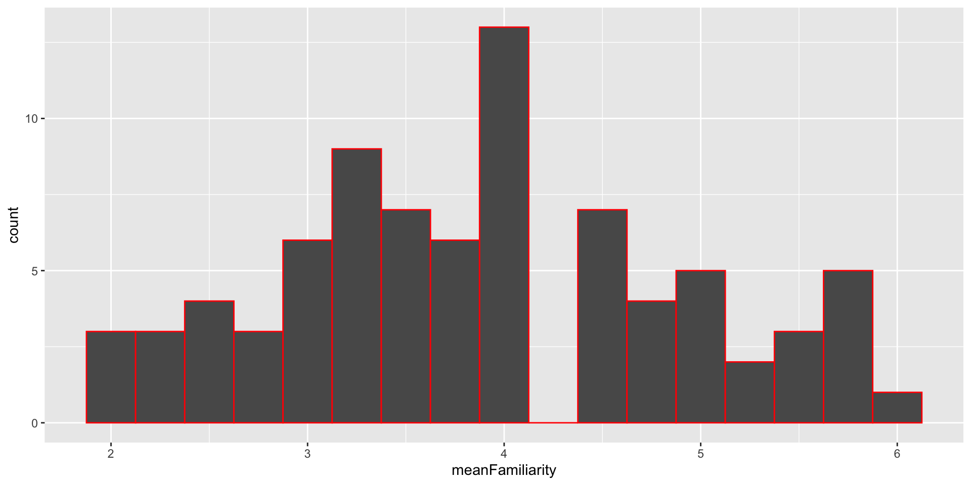
geom_histogram()
color - What should the outline color be?
geom_histogram()
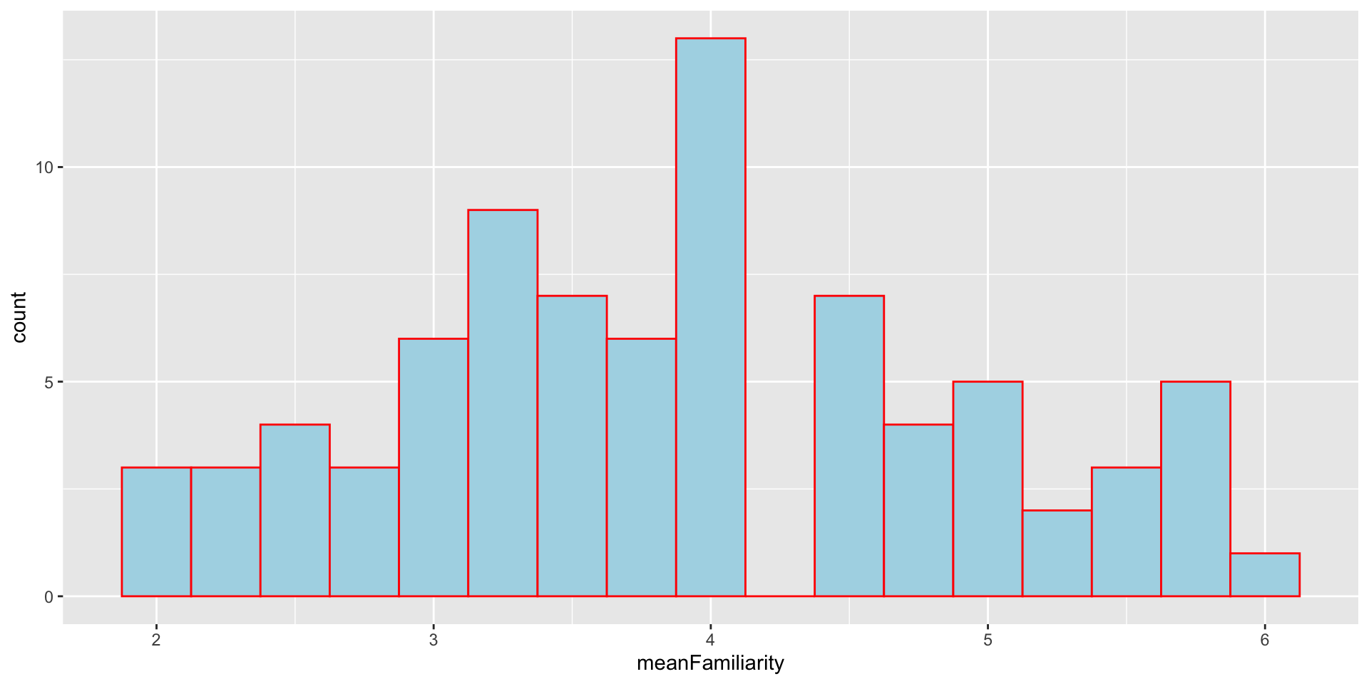
fill - What should the fill color be?
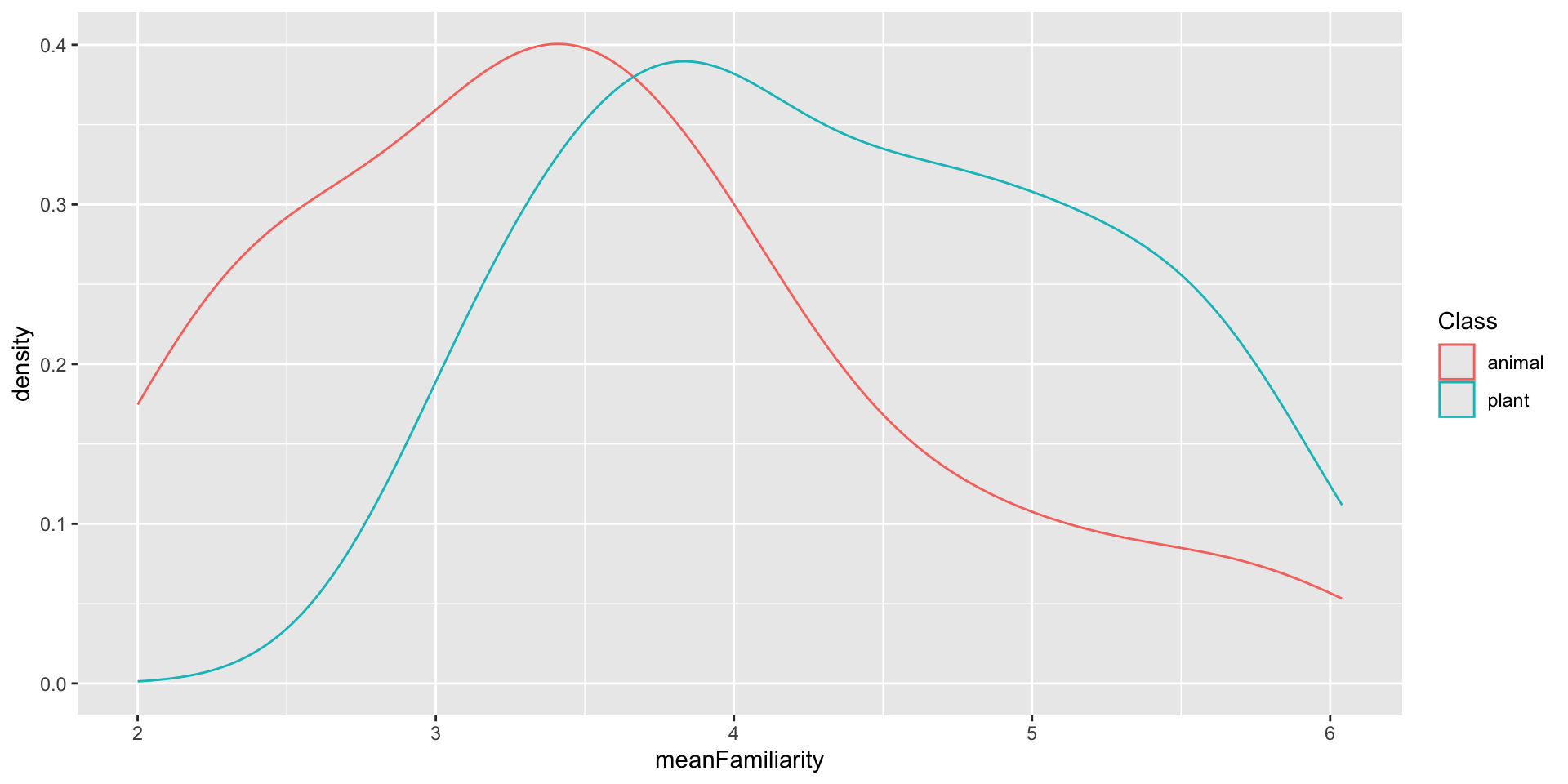
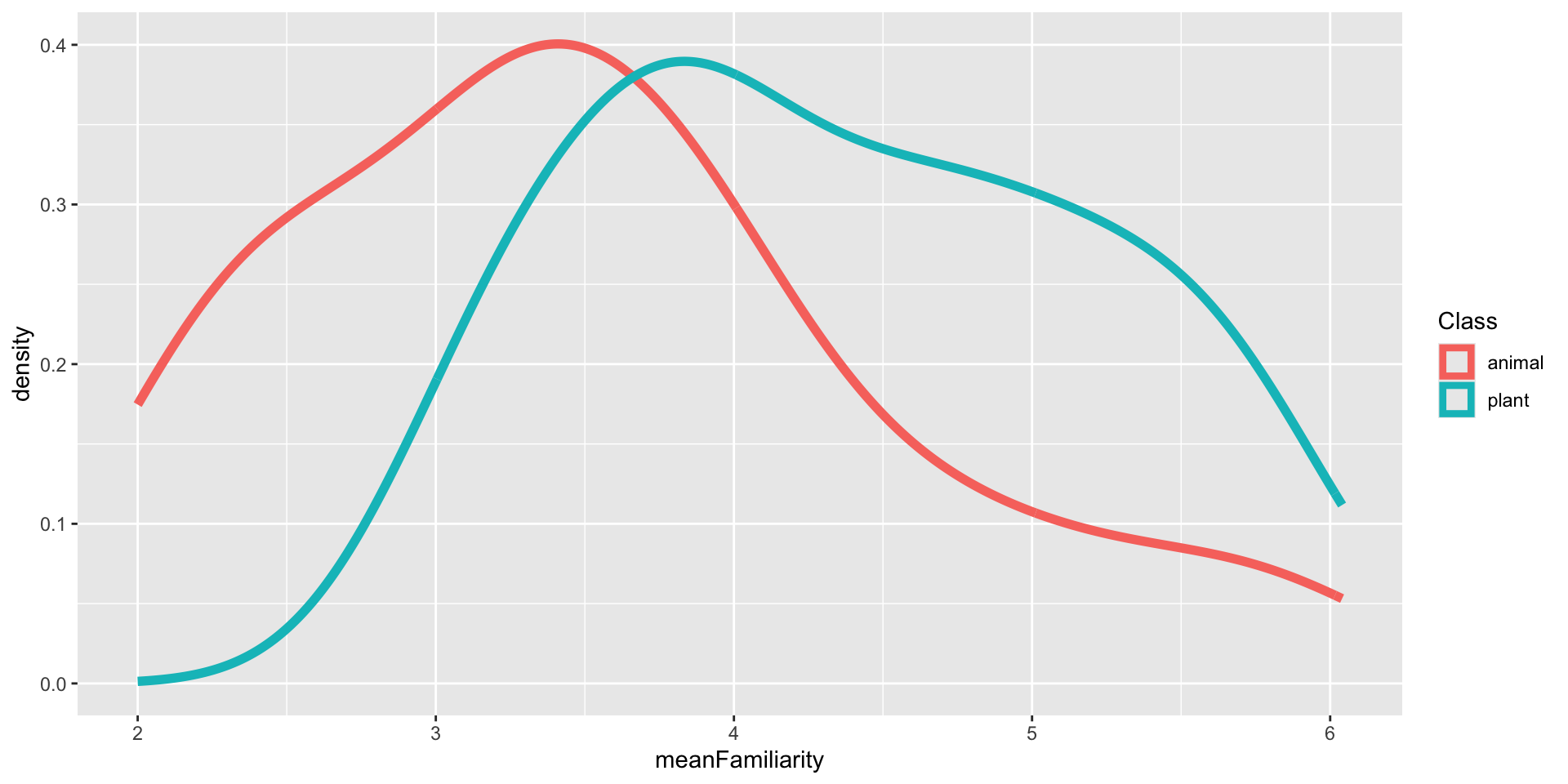
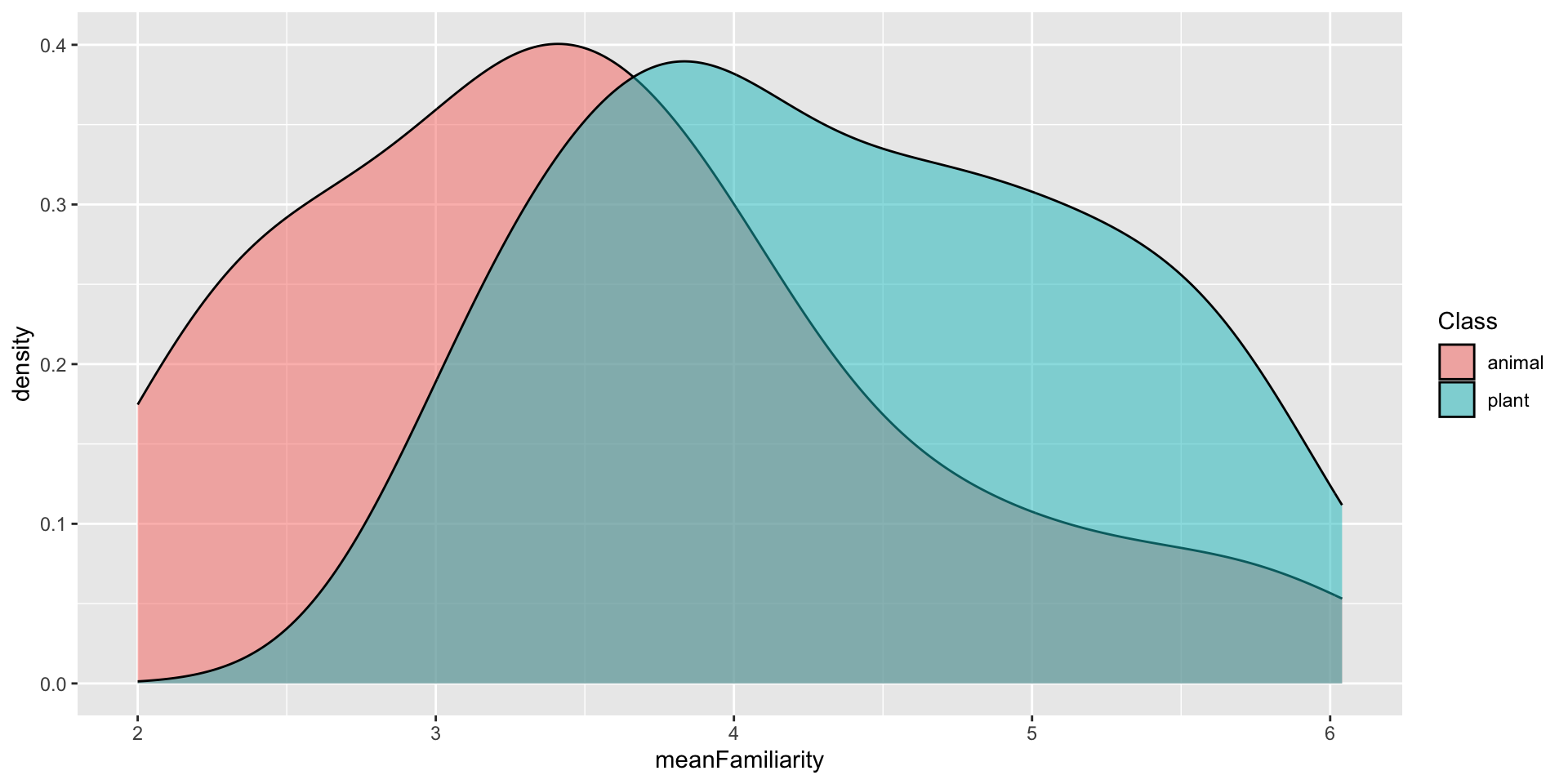
geom_density()
Imagine a histogram made out of wooden blocks. Then, imagine that you drop a cooked spaghetti string over it. The shape the spaghetti will take draped over blocks can be thought of as the shape of the density curve. – R4DS
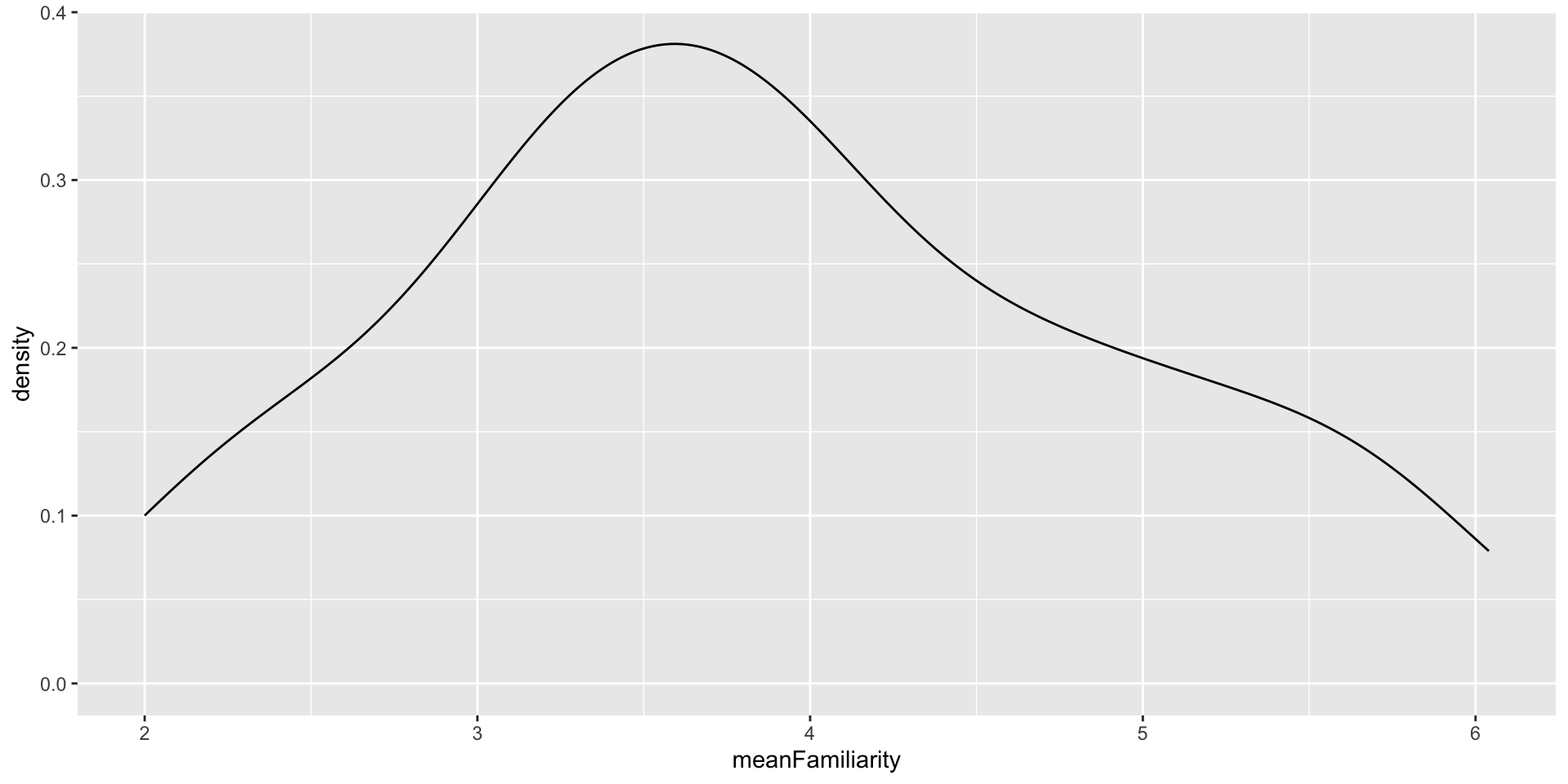
geom_density()
Map Class to color aesthetic
geom_density()
Set linewidth
geom_density()
Map Class to fill and set alpha
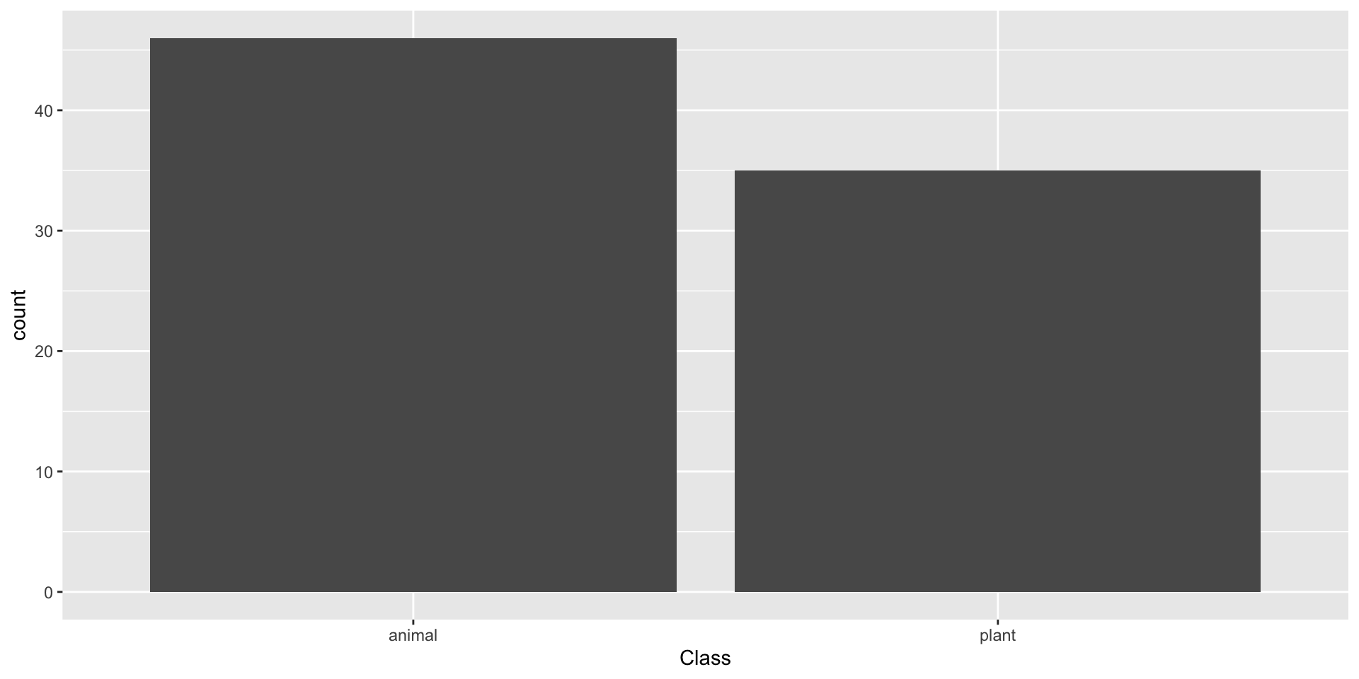
geom_bar()
To examine the distribution of a categorical variable, you can use a bar chart. The height of the bars displays how many observations occurred with each x value. – R4DS
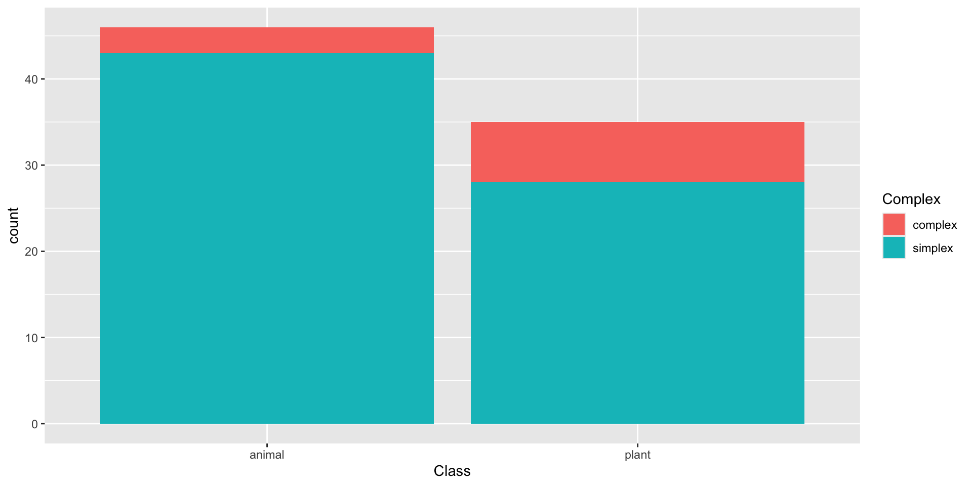
geom_bar() - stacked
We can use stacked bar plots to visualize the relationship between two categorical variables
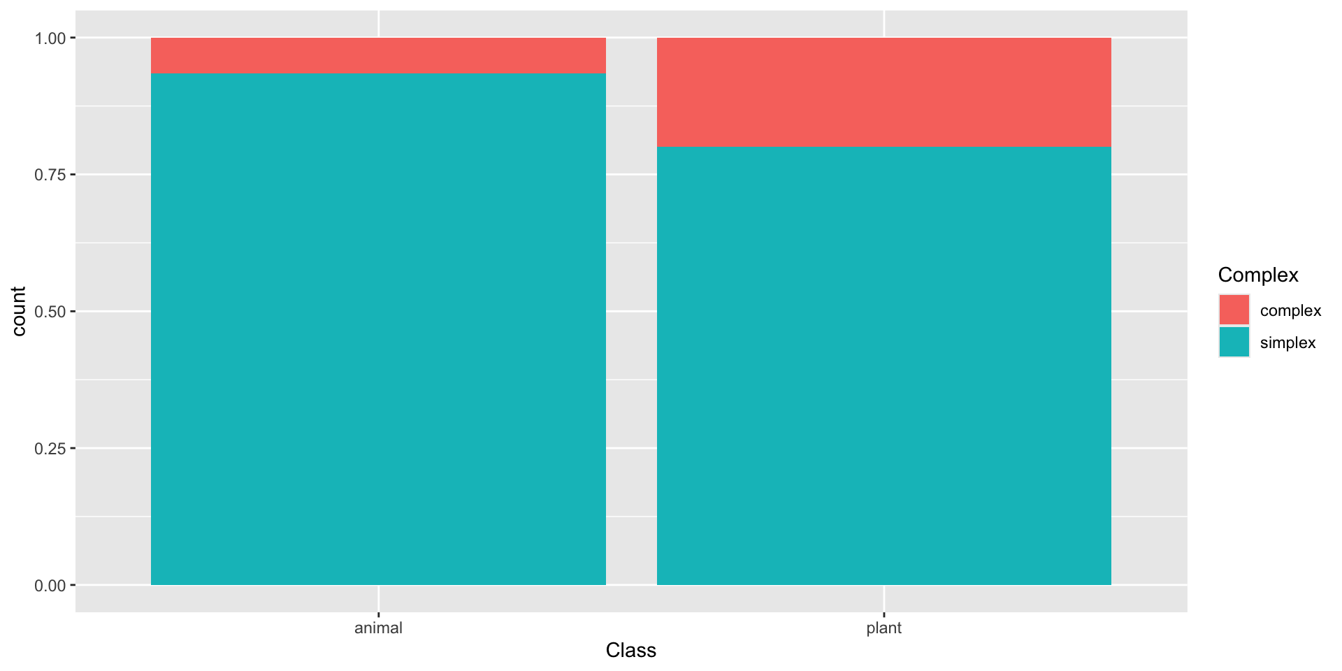
geom_bar() - relative frequency
We can use relative frequency to visualize the relationship between two categorical variables (as a percentage)
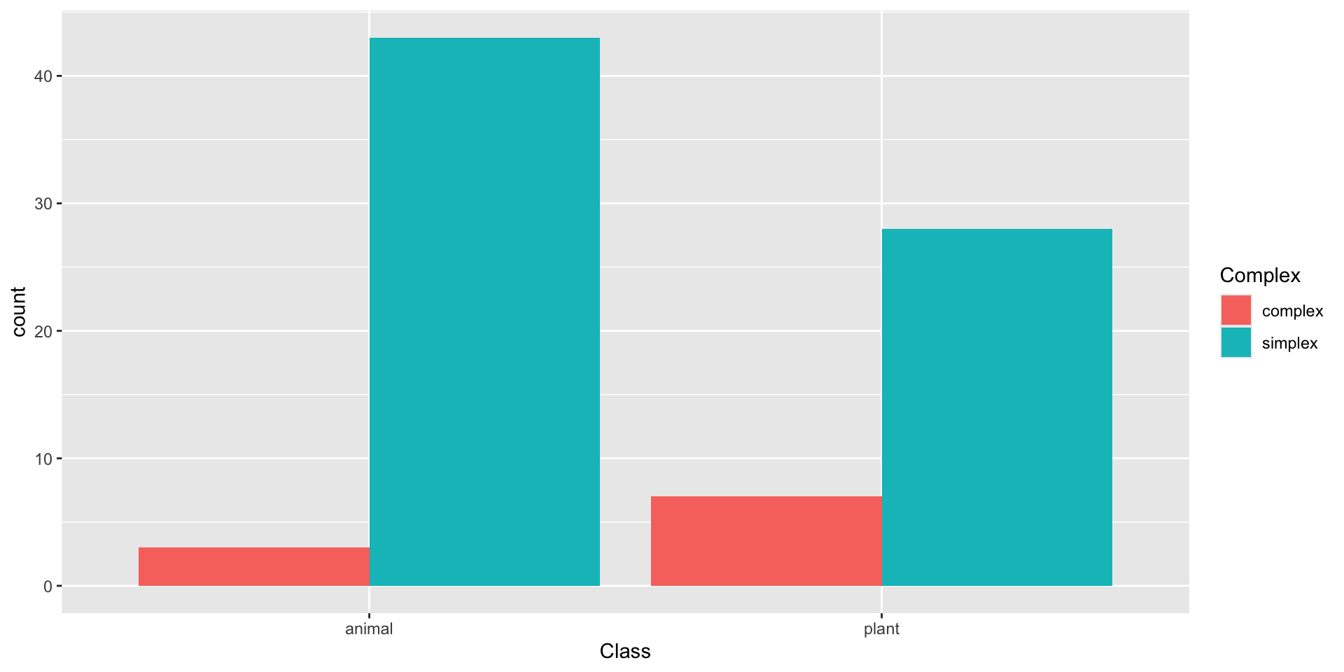
geom_bar() - dodged
We can use a dodged bar plot to visualize the relationship between two categorical variables side-by-side, not stacked
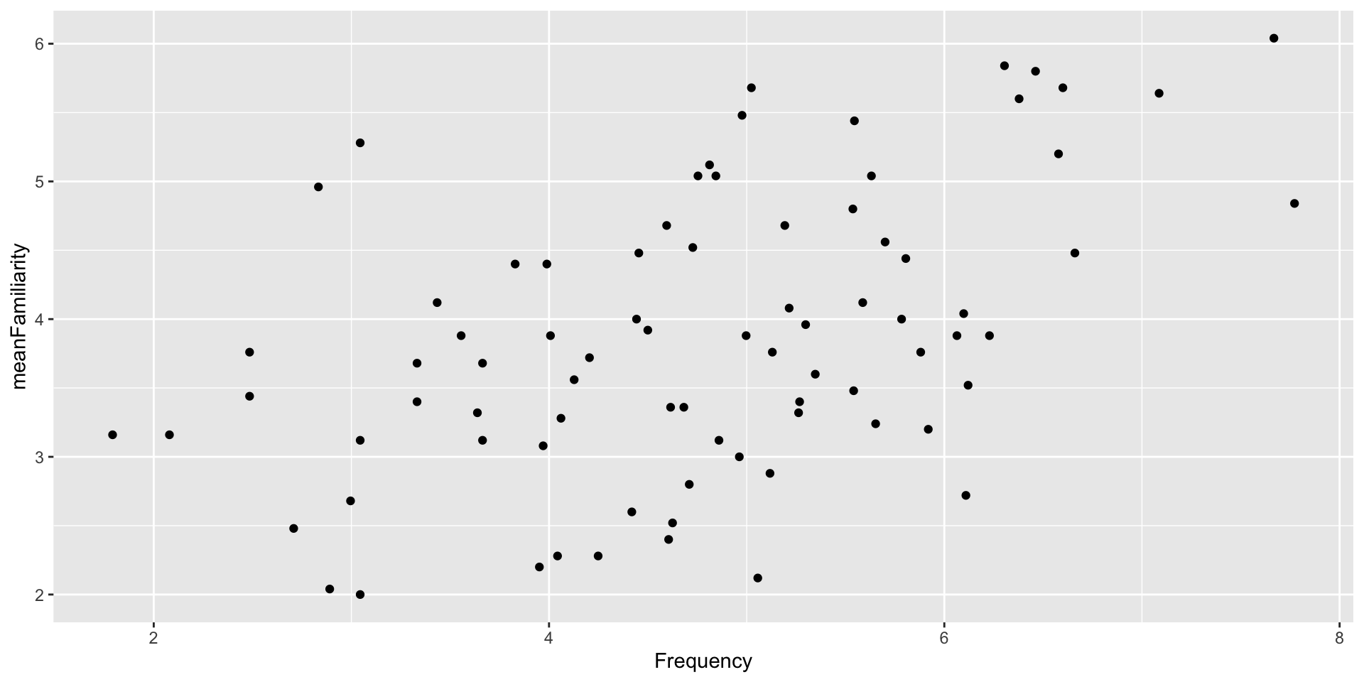
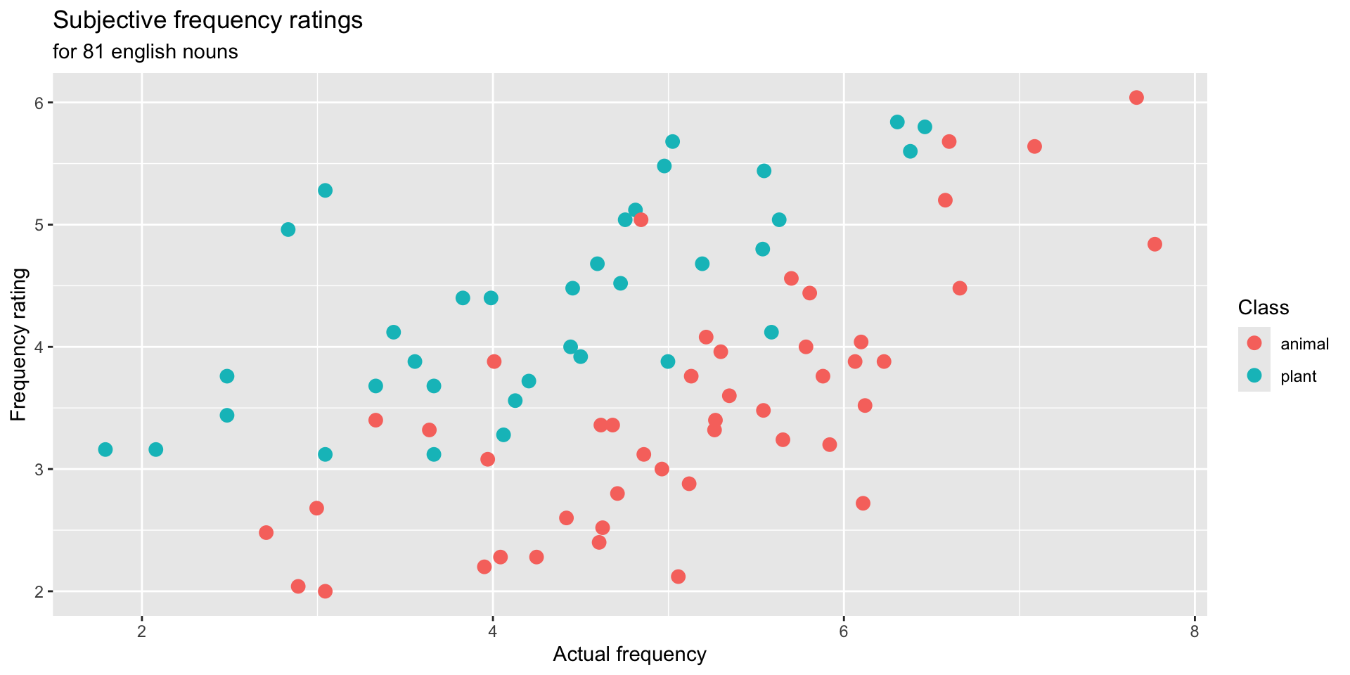
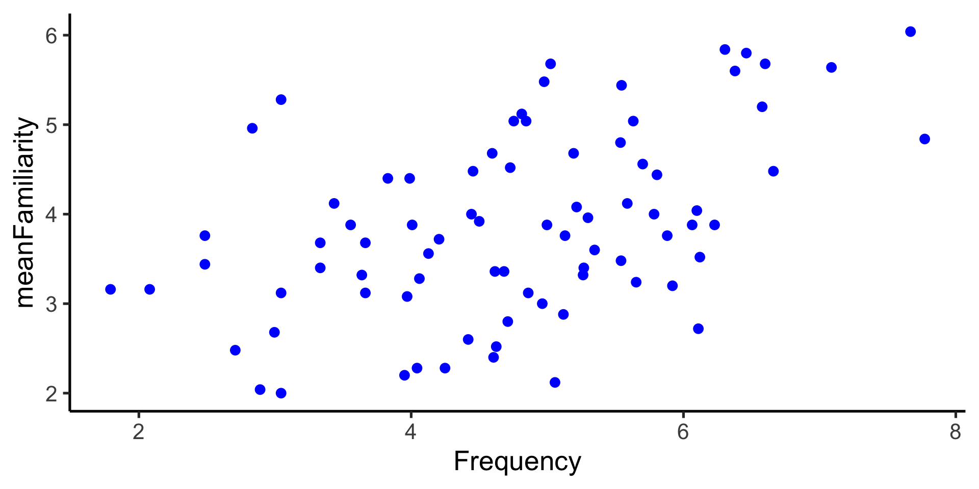
geom_point()
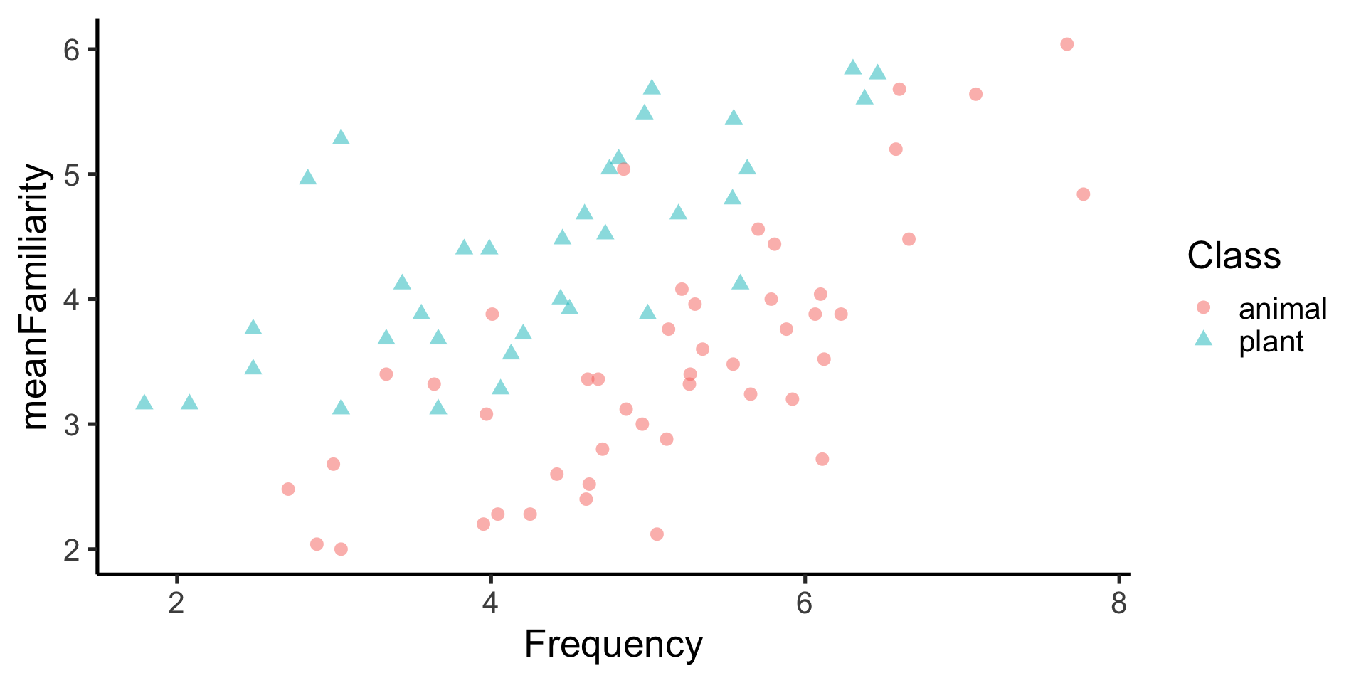
Scatterplots are useful for displaying the relationship between two numerical variables – R4DS
ggplot(
data = ratings,
mapping = aes(
x = Frequency,
y = meanFamiliarity
)
) +
geom_point(
color = "blue",
size = 3
) +
labs(
title = "Subjective frequency ratings",
subtitle = "for 81 english nouns",
x = "Actual frequency",
y = "Frequency rating",
color = "word class"
) +
theme_classic(base_size = 20) 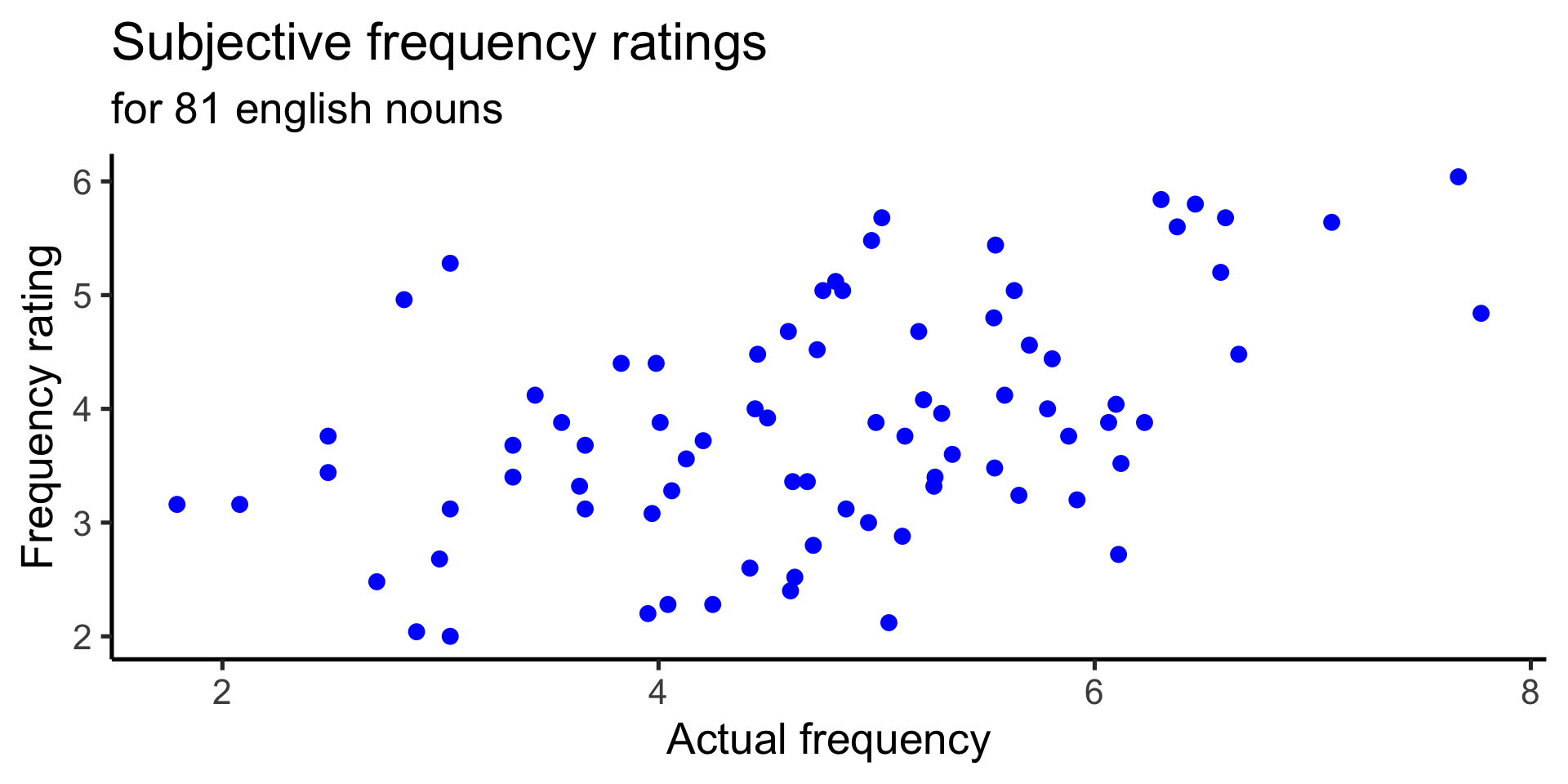
geom_point() with geom_smooth()
draws a best fitting curve
ggplot(
data = ratings,
mapping = aes(
x = Frequency,
y = meanFamiliarity
)
) +
geom_point(
color = "blue",
size = 3
) +
geom_smooth() +
labs(
title = "Subjective frequency ratings",
subtitle = "for 81 english nouns",
x = "Actual frequency",
y = "Frequency rating",
color = "word class"
) +
theme_classic(base_size = 20) 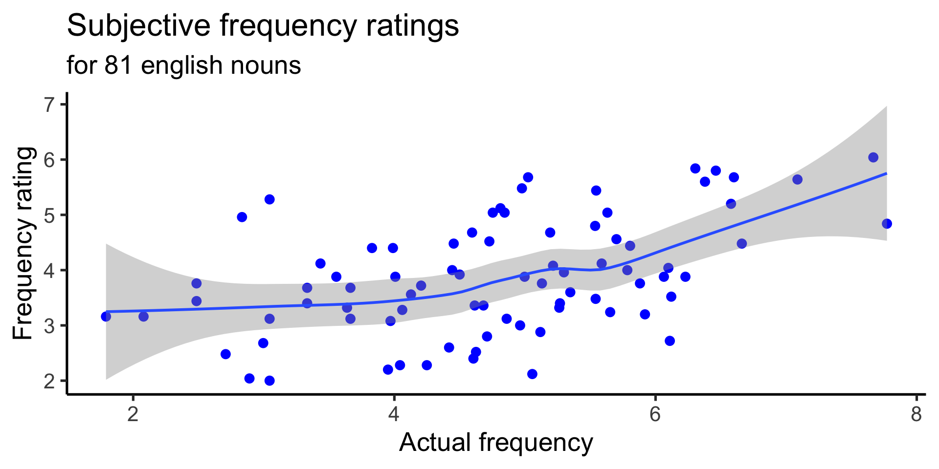
geom_point() with geom_smooth(method="lm")
draws the best fitting linear model
ggplot(
data = ratings,
mapping = aes(
x = Frequency,
y = meanFamiliarity
)
) +
geom_point(
color = "blue",
size = 3
) +
geom_smooth(method="lm") +
labs(
title = "Subjective frequency ratings",
subtitle = "for 81 english nouns",
x = "Actual frequency",
y = "Frequency rating",
color = "word class"
) +
theme_classic(base_size = 20) 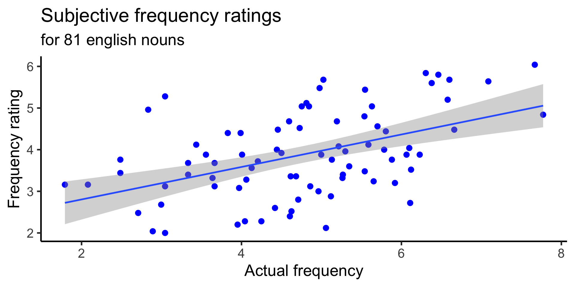
geom_point() with geom_smooth(method="lm")
We can also map to color, by specifying globally
ggplot(
data = ratings,
mapping = aes(
x = Frequency,
y = meanFamiliarity,
color = Class
)
) +
geom_point(
size = 3
) +
geom_smooth(method="lm") +
labs(
title = "Subjective frequency ratings",
subtitle = "for 81 english nouns",
x = "Actual frequency",
y = "Frequency rating",
color = "word class"
) +
theme_classic(base_size = 20) 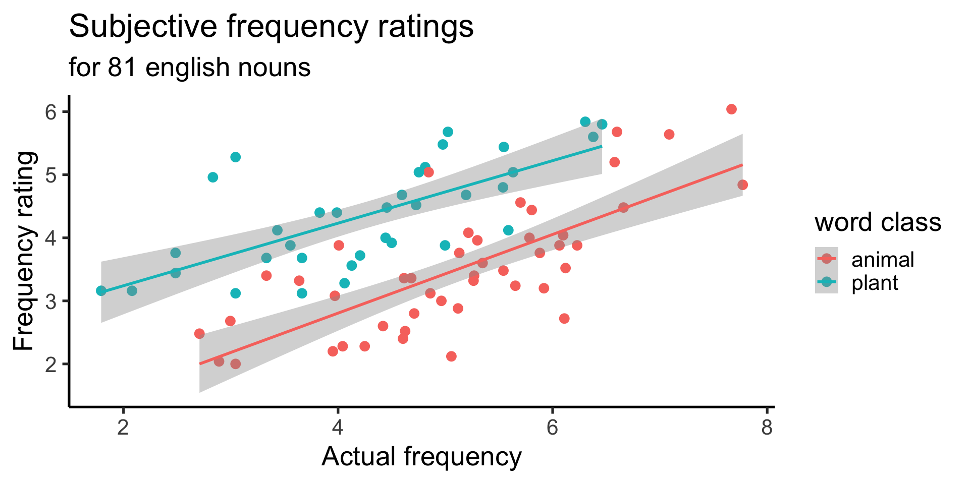
geom_point() with geom_smooth(method="lm")
Or include only a single smooth, by specifying color in the point geom only
ggplot(
data = ratings,
mapping = aes(
x = Frequency,
y = meanFamiliarity
)
) +
geom_point(
aes(color = Class),
size = 3
) +
geom_smooth(method="lm") +
labs(
title = "Subjective frequency ratings",
subtitle = "for 81 english nouns",
x = "Actual frequency",
y = "Frequency rating",
color = "word class"
) +
theme_classic(base_size = 20) 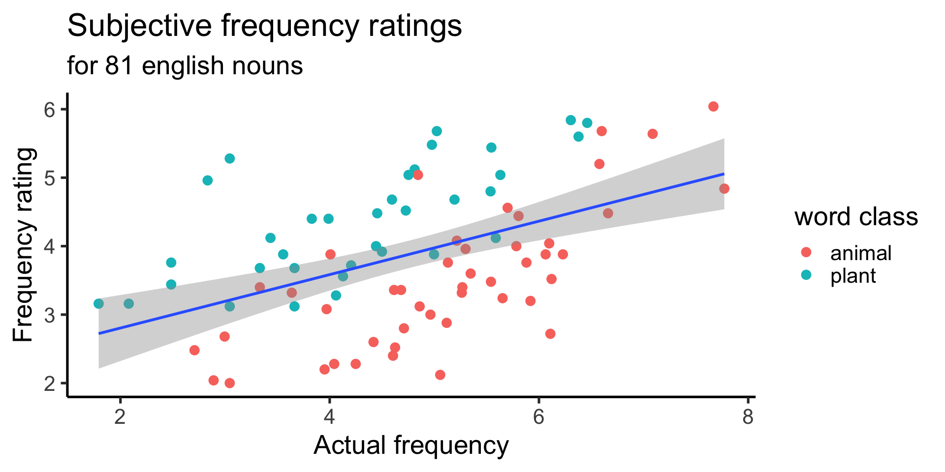
facet_grid()
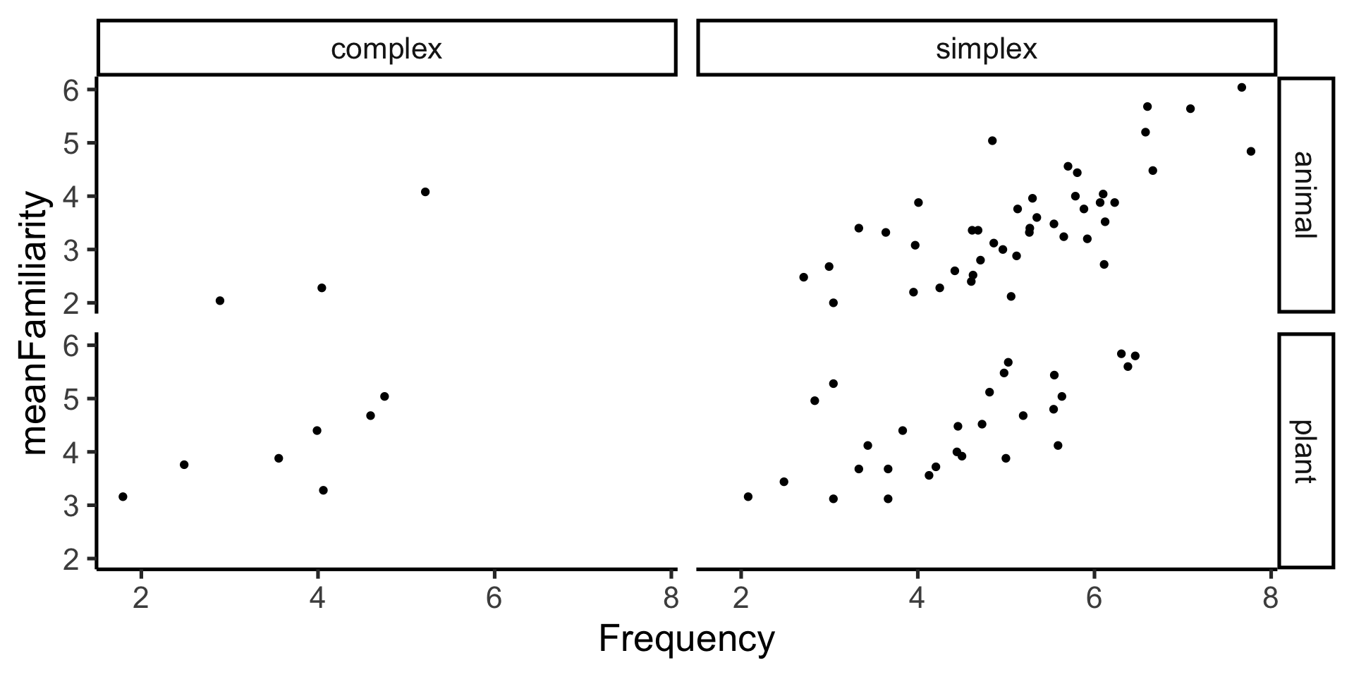
facet_grid()

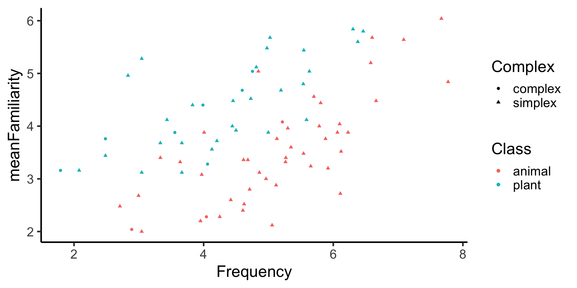
facet_grid() - just columns
and note we can still map other aesthetics!
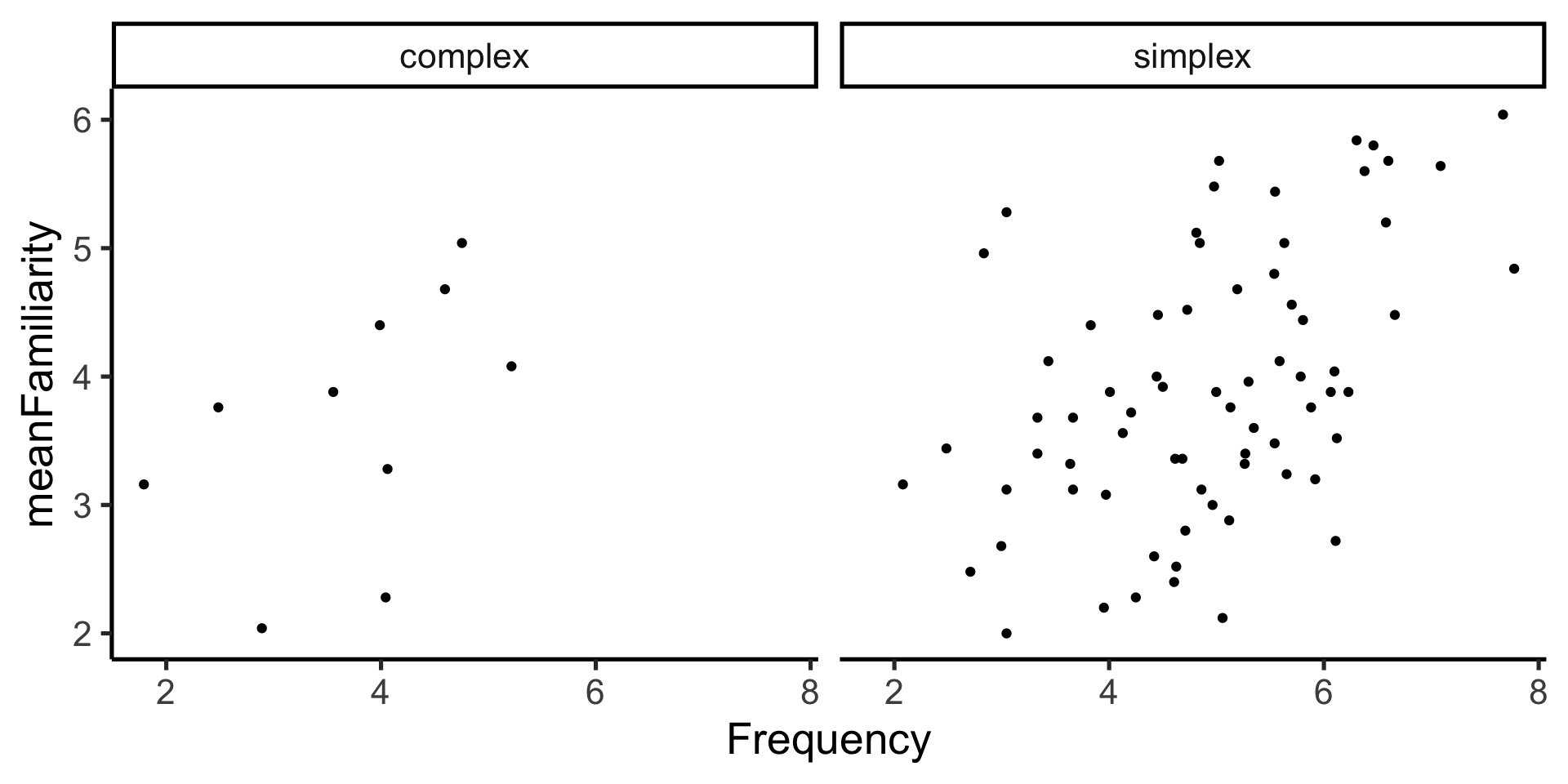
facet_grid() - just columns
and note we can still map other aesthetics!
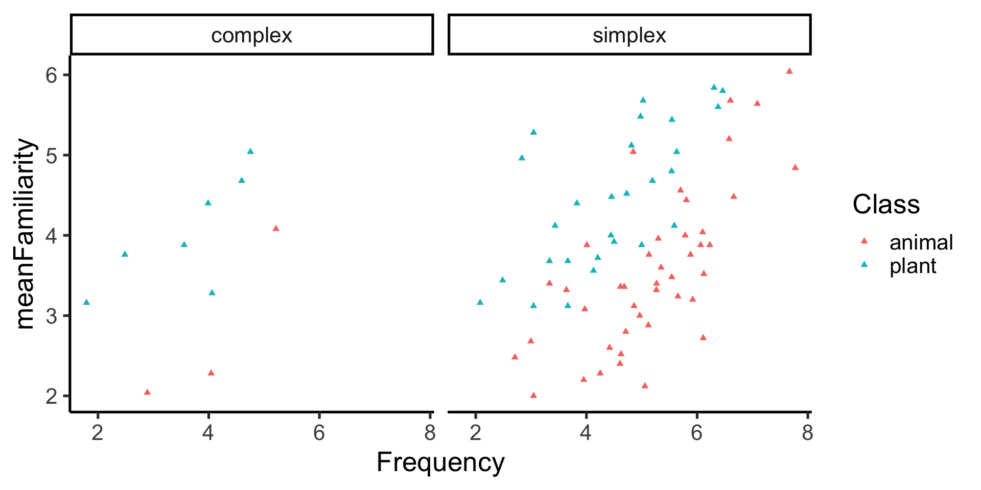
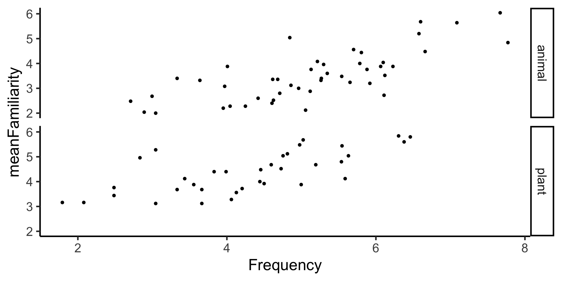
facet_grid() - just rows
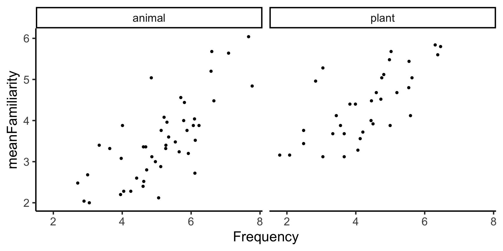
facet_wrap()
facet_wrap() - number of columns
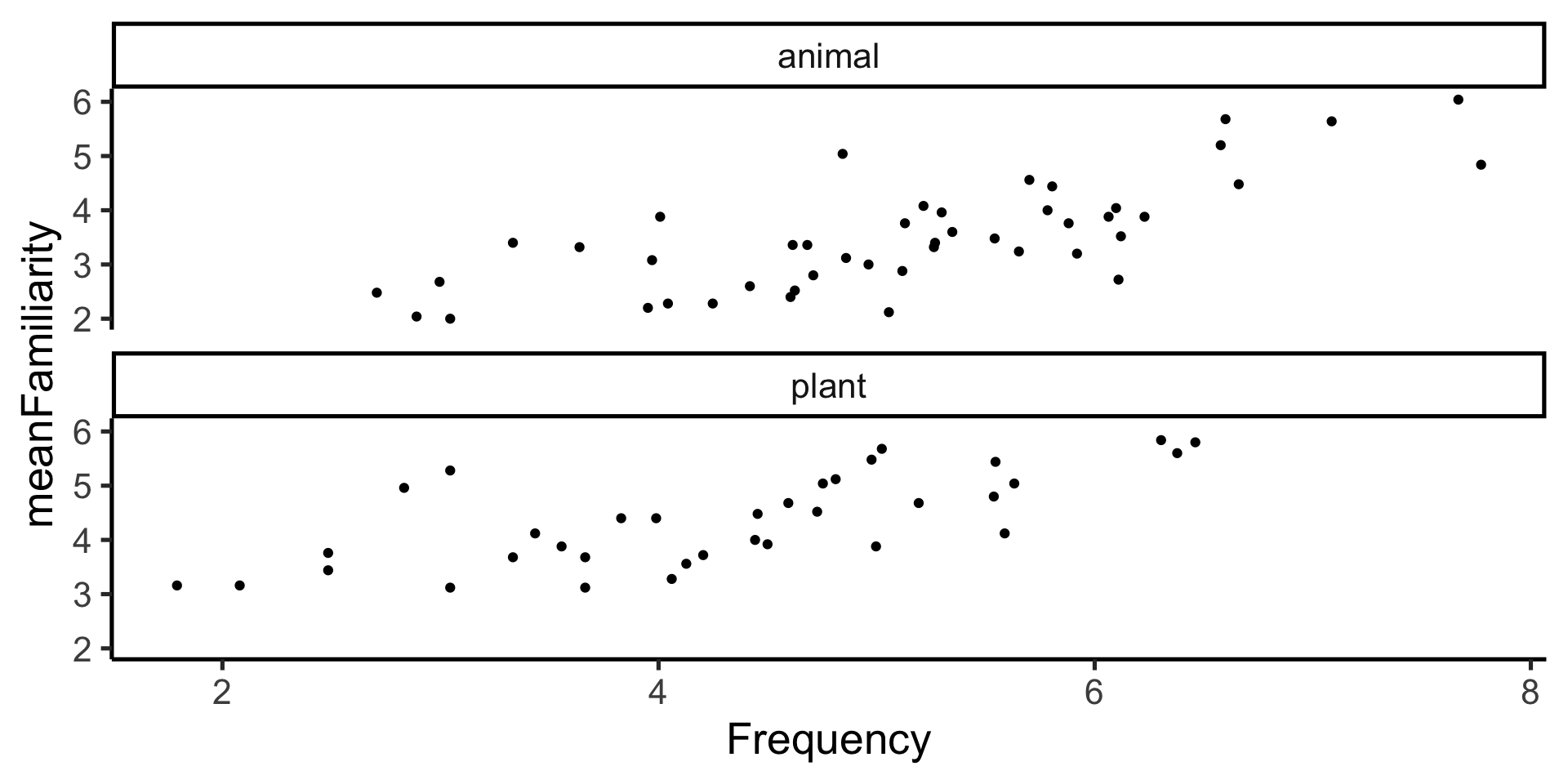
remember our goal plot?
ggplot(
    data = ratings,
    mapping = aes(
        x = Frequency,
        y = meanFamiliarity
    )
 ) +
  geom_point(
    mapping = aes(color = Class),
    size = 3
    ) +
  labs(
    title = "Subjective frequency ratings",
    subtitle = "for 81 english nouns",
    x = "Actual frequency",
    y = "Frequency rating",
    color = "word class"
) +
theme_classic(base_size = 20) +
scale_color_brewer(palette = "Paired")
last_plot()
returns the last plot

Default theme
Sample themes

ggplot2 calls


the pipe %>% and ggplot


Exercise 1
The basic ggplot
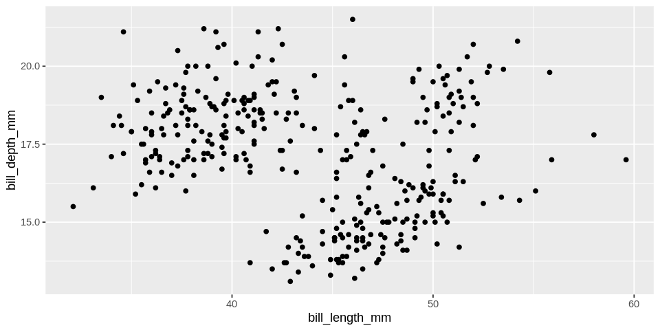
Figure 3: Data from penguins dataframe in palmerpenguins package
Exercise 2
Practice adding aesthetics and layers by creating this!
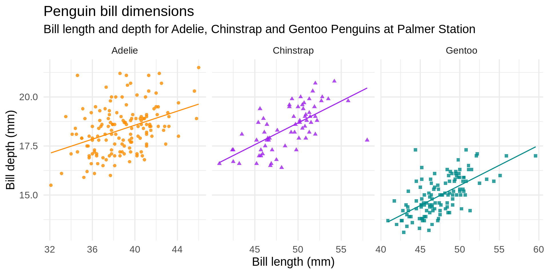
Figure 4: Data from penguins dataframe in palmerpenguins package
Exercise 3
Need a challenge? Use the
datasaurus_dozendata from thedatasauRusR package to create this!